Overview
Formerly CrowdRise, the platform powered $500M+ in donations across 20K+ nonprofits through scalable, campaign-based fundraising and peer-to-peer giving. Acquired by GoFundMe in 2017, valued at over $600M.
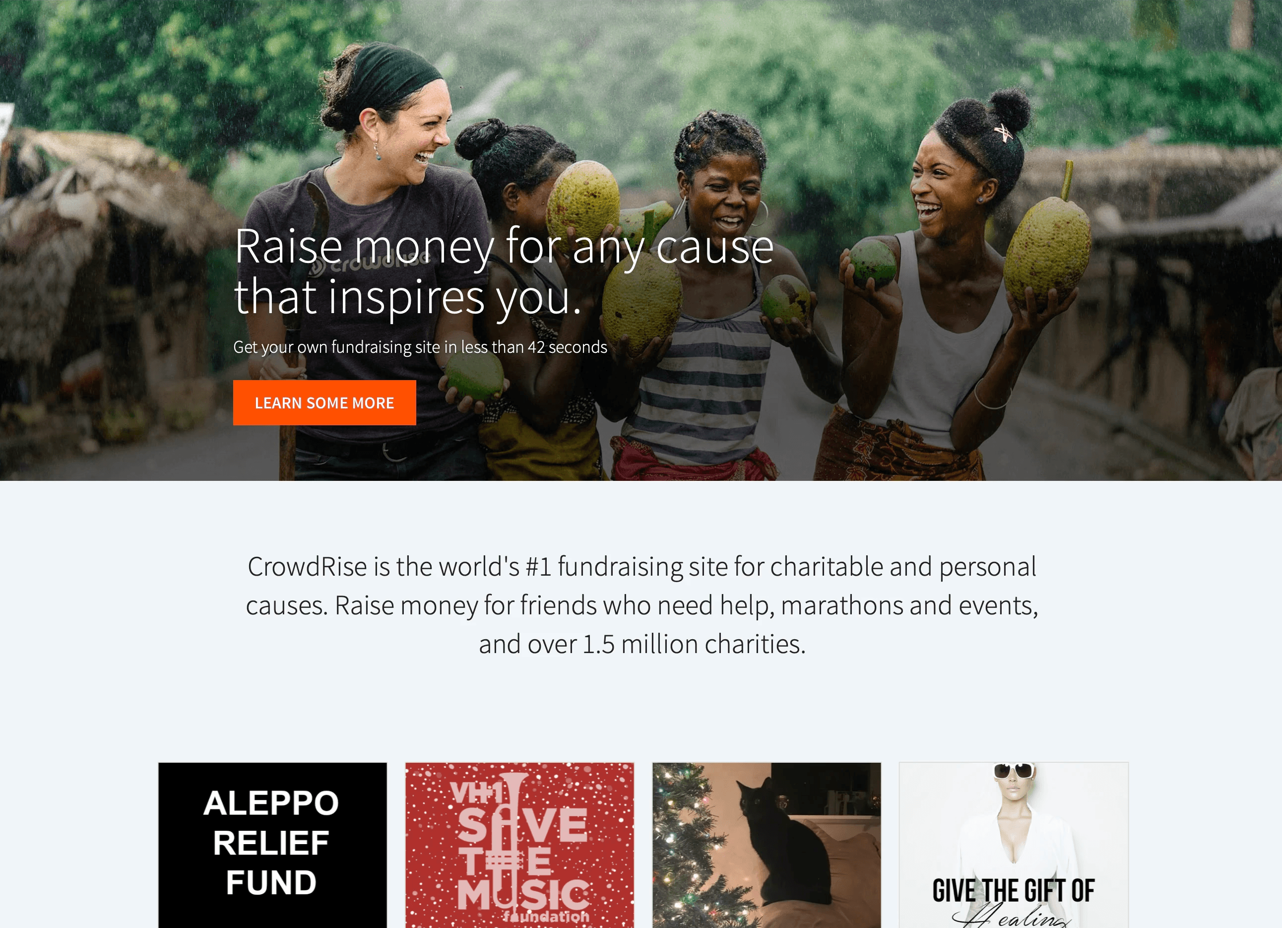
CrowdRise began as a small Los Angeles-based product team of six developers, supported by a Customer Success team in Detroit. The mission was to make fundraising feel personal, not transactional. As the founding designer, I built the UX and design system from the ground up, scaling it into a global platform that powered $500M+ in donations and supported millions of campaigns.
Vision & Context
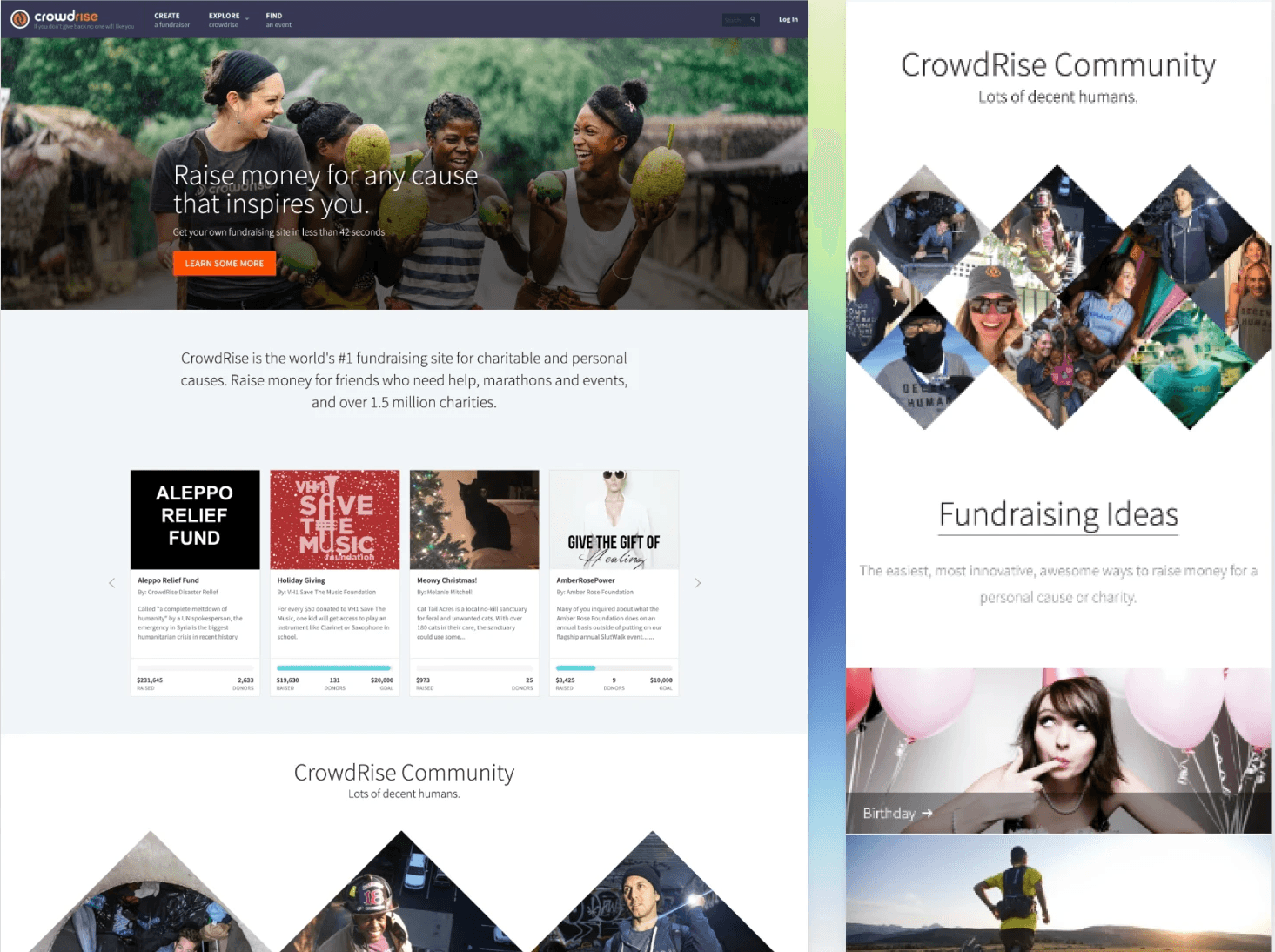
The mission was to connect generosity with identity. To make giving feel like something you wanted to do, not something you were guilted into. Our tone was irreverent, weird, occasionally chaotic, and full of humor. We used jokes to lower the guard and design to raise the trust.
CrowdRise was never about sterile forms or corporate campaigns. It was about heart, laughter, and those “holy shit, I can actually help this person” moments.
Understanding the Problem
Most donation platforms felt like paperwork. They drained the emotion from generosity. We wanted to design a system that felt like an inside joke between friends, not a transaction. The challenge was not usability, it was soul.
I mapped the donor journey through empathy, not steps. What moments made someone laugh, linger, or lean in? Where did friction kill the feeling?
The data pointed to something simple.
People trusted people who made them feel seen.
Strategic Approach
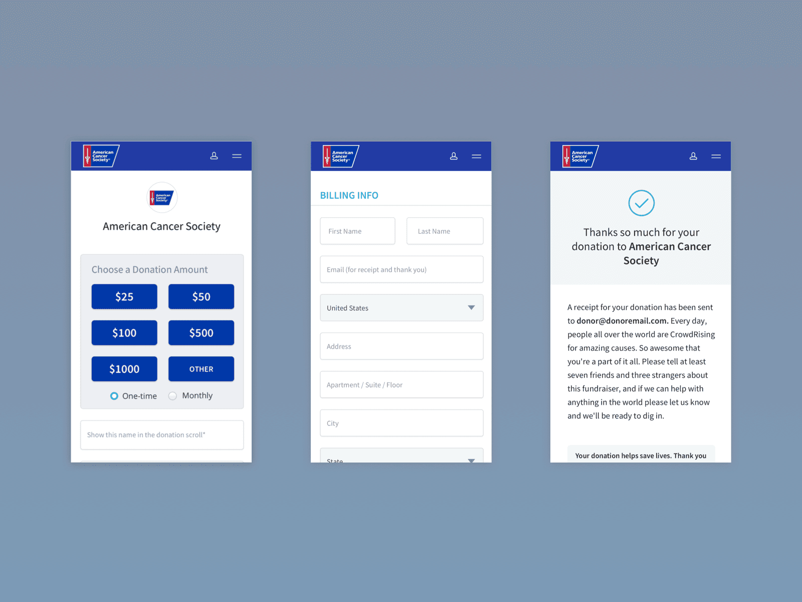
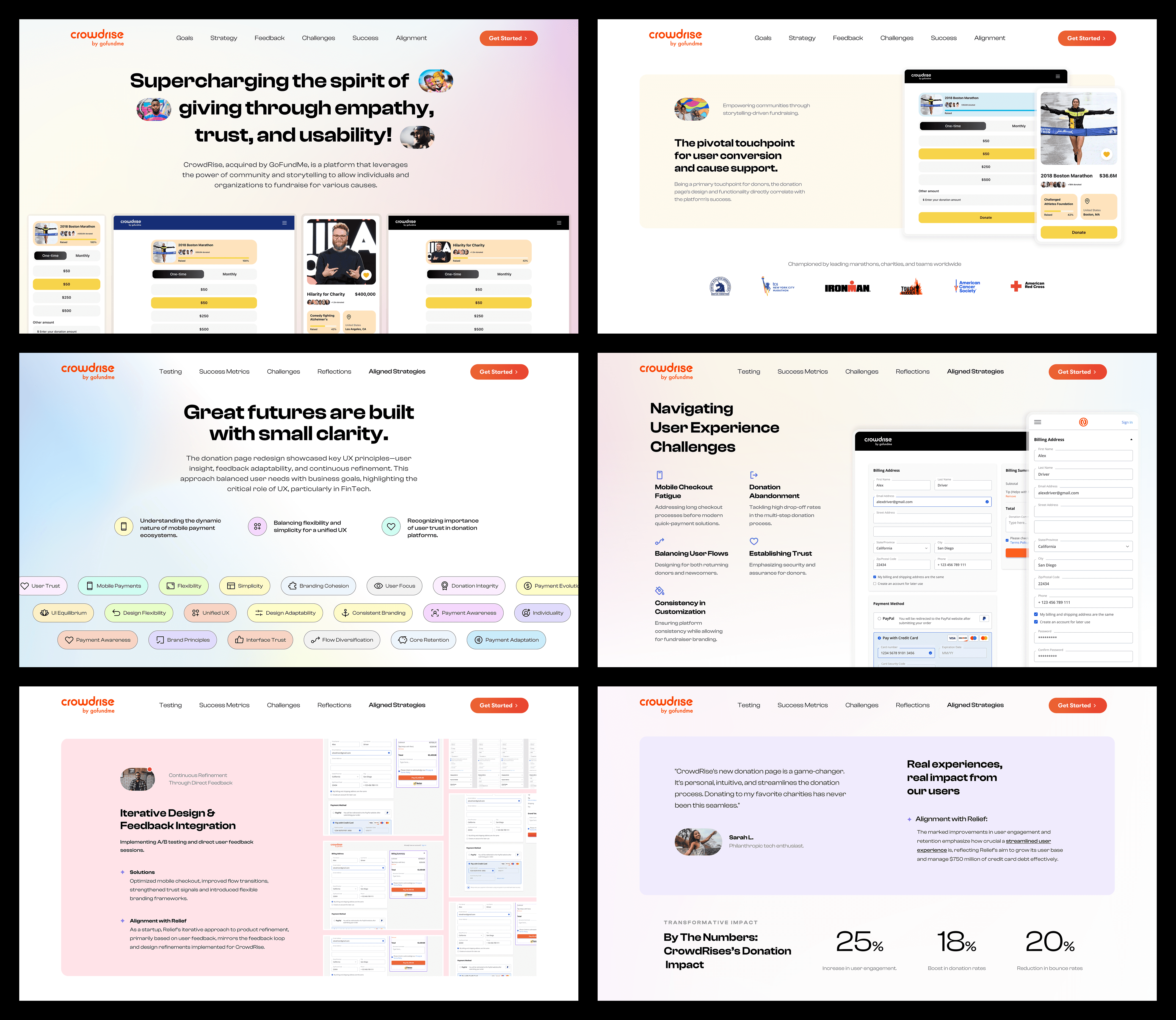
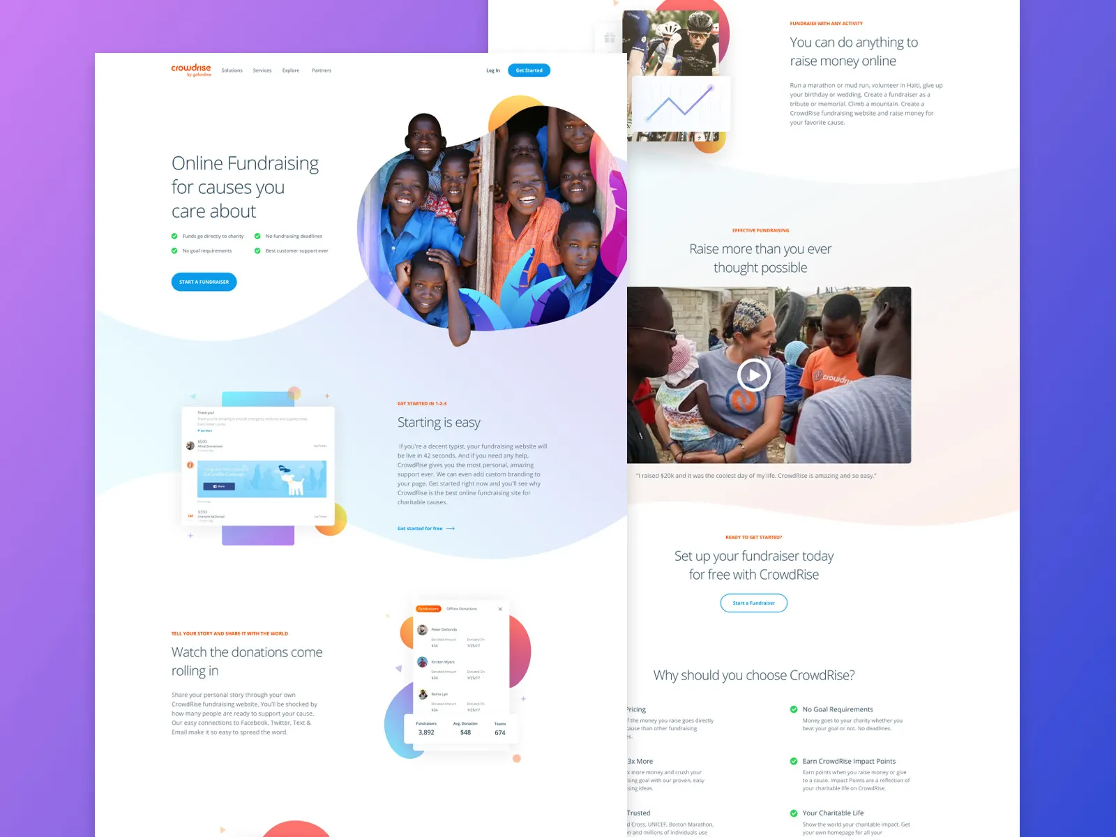
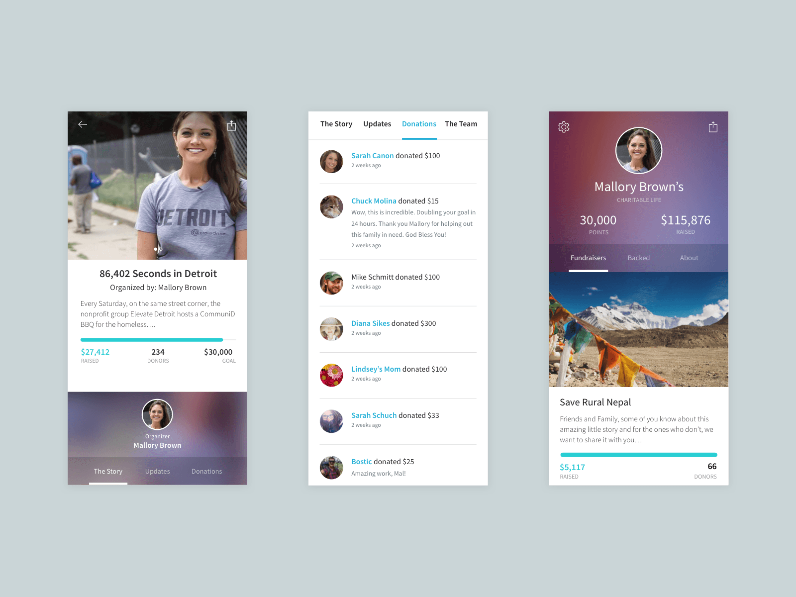
We designed for connection first, conversion second. Donation flows were rebuilt for transparency and warmth, less sterile and more story. Completion rates went up 35%, successful transactions increased 18%, and average gift size rose 12%.
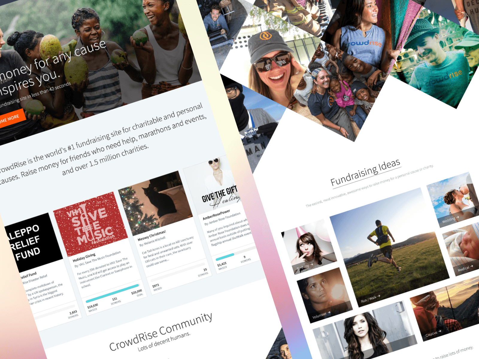
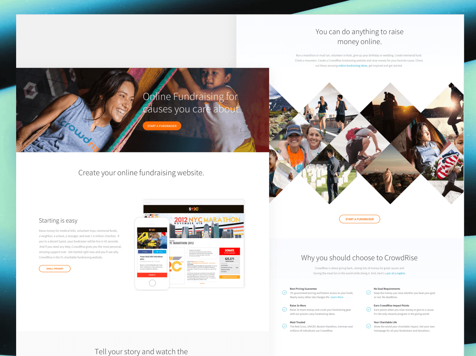
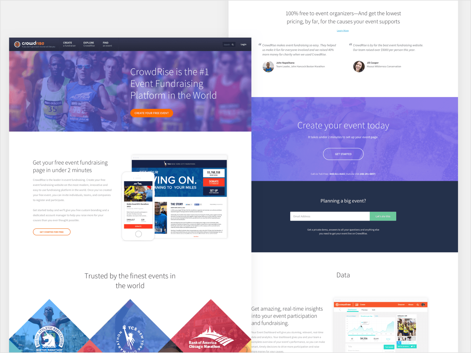
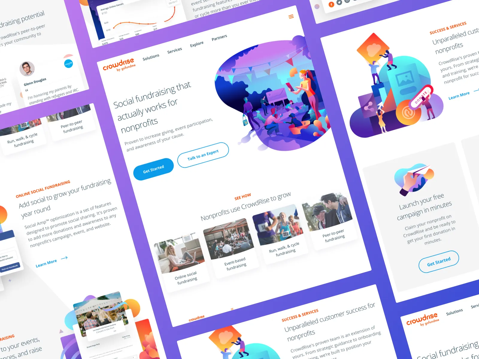
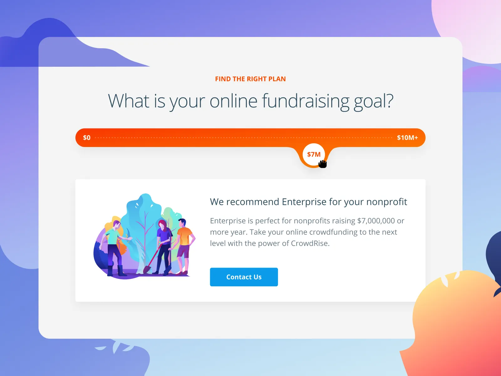
We built flexible, expressive campaign templates so nonprofits and individuals could tell stories their way, cutting setup time by half and keeping emotion at the center.
System Architecture Thinking
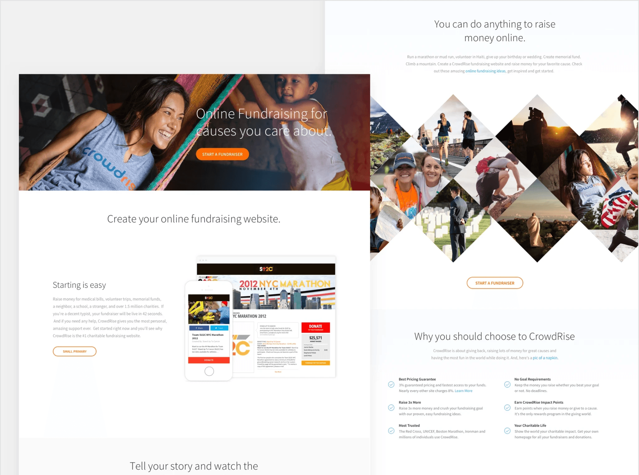
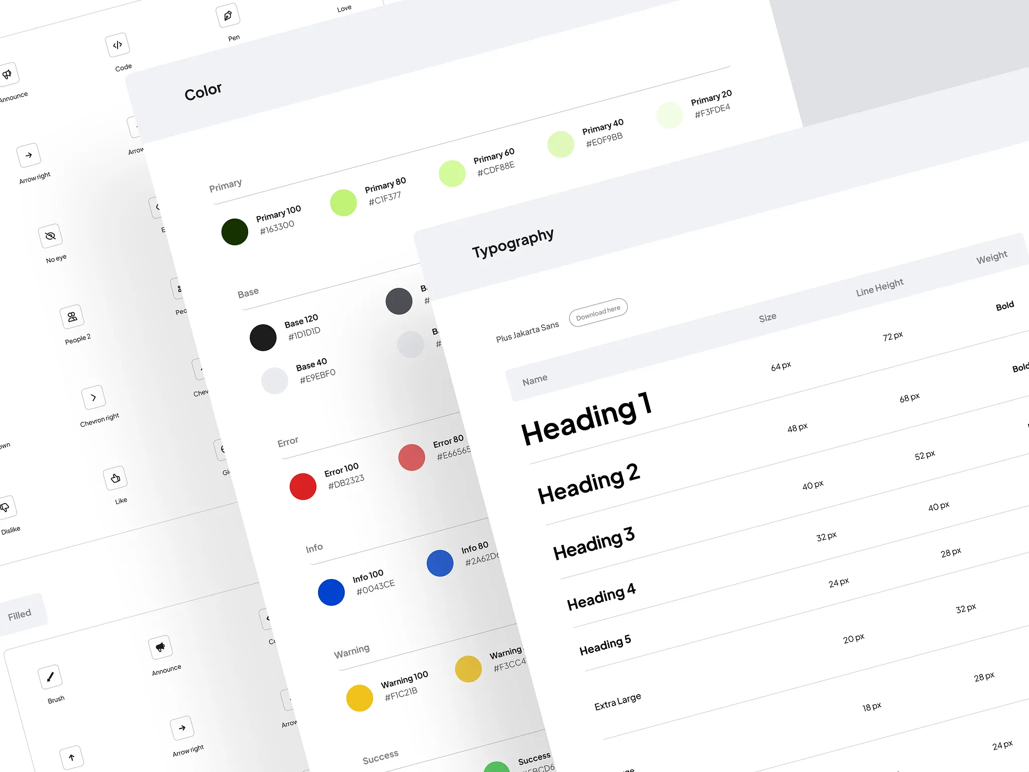
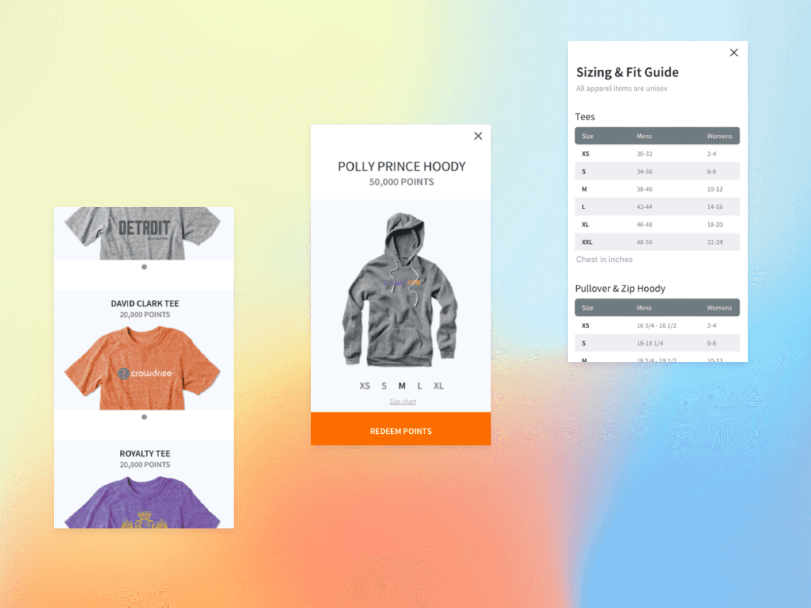
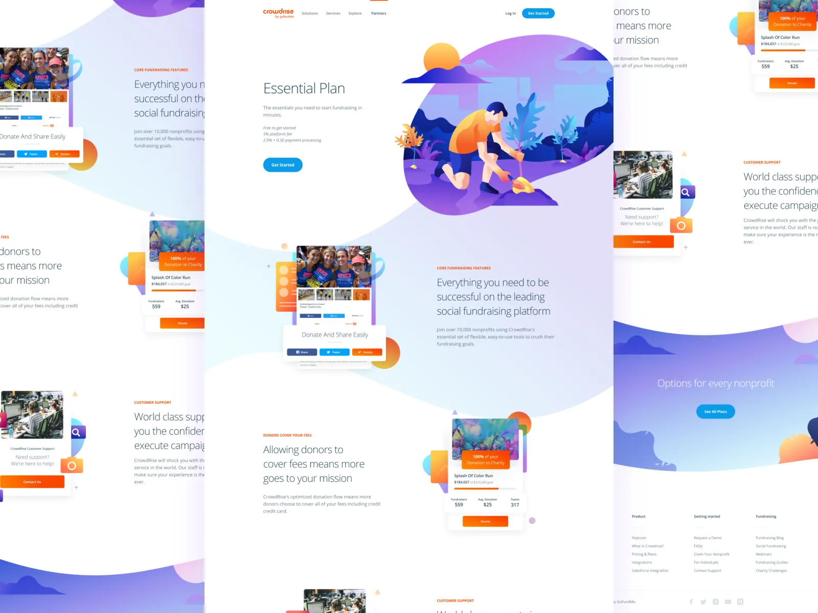
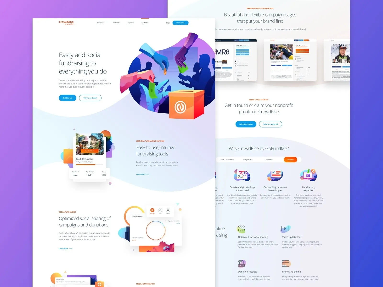
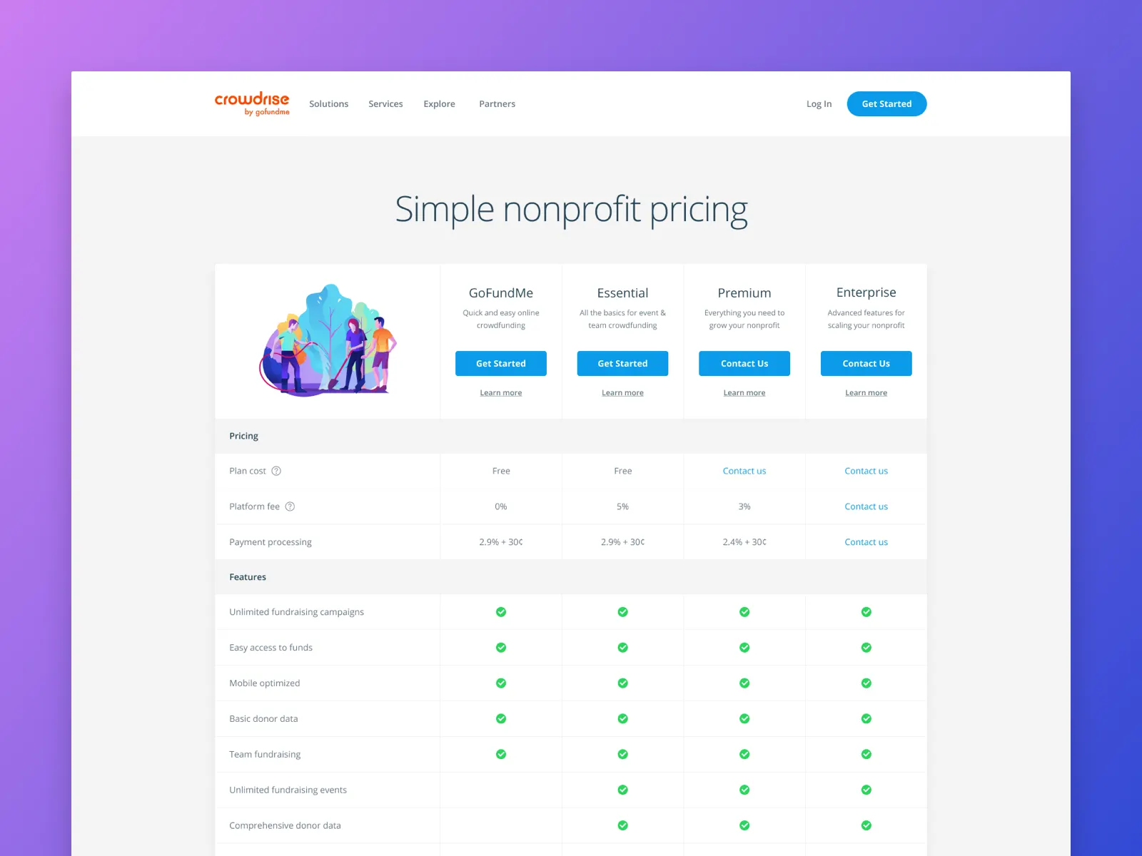
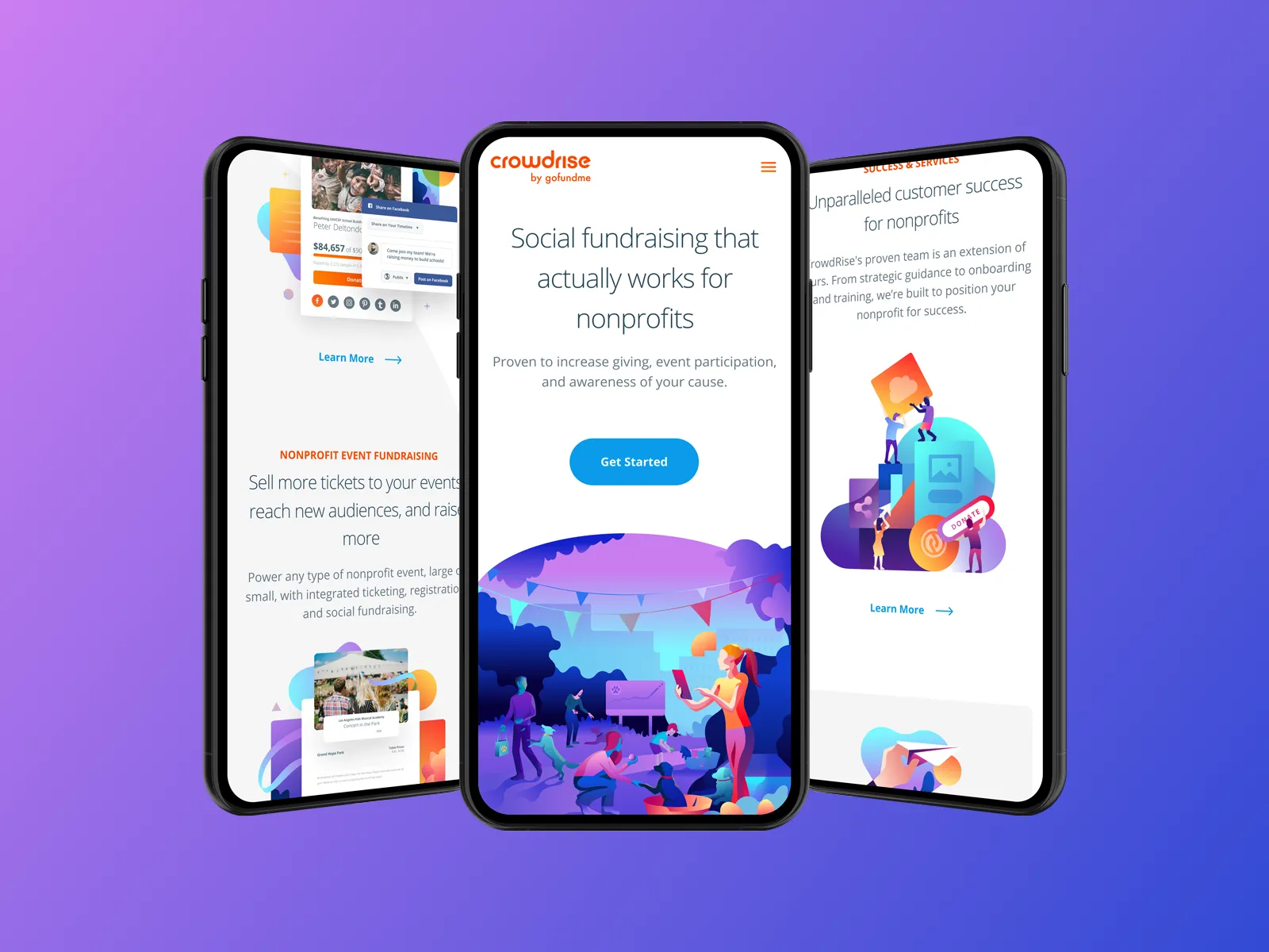
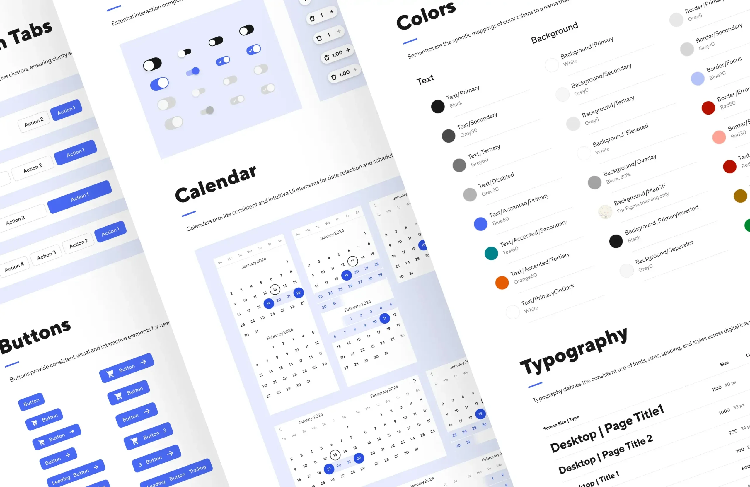
The design system reflected who we were: funny, functional, and grounded in clarity. It unified product, mobile, and marketing into one visual language that made generosity easy to give and easy to share.
By the time the company grew to more than 50 engineers and a full Detroit success team, one designer and one system supported millions of people raising money for each other.
Scaling Up
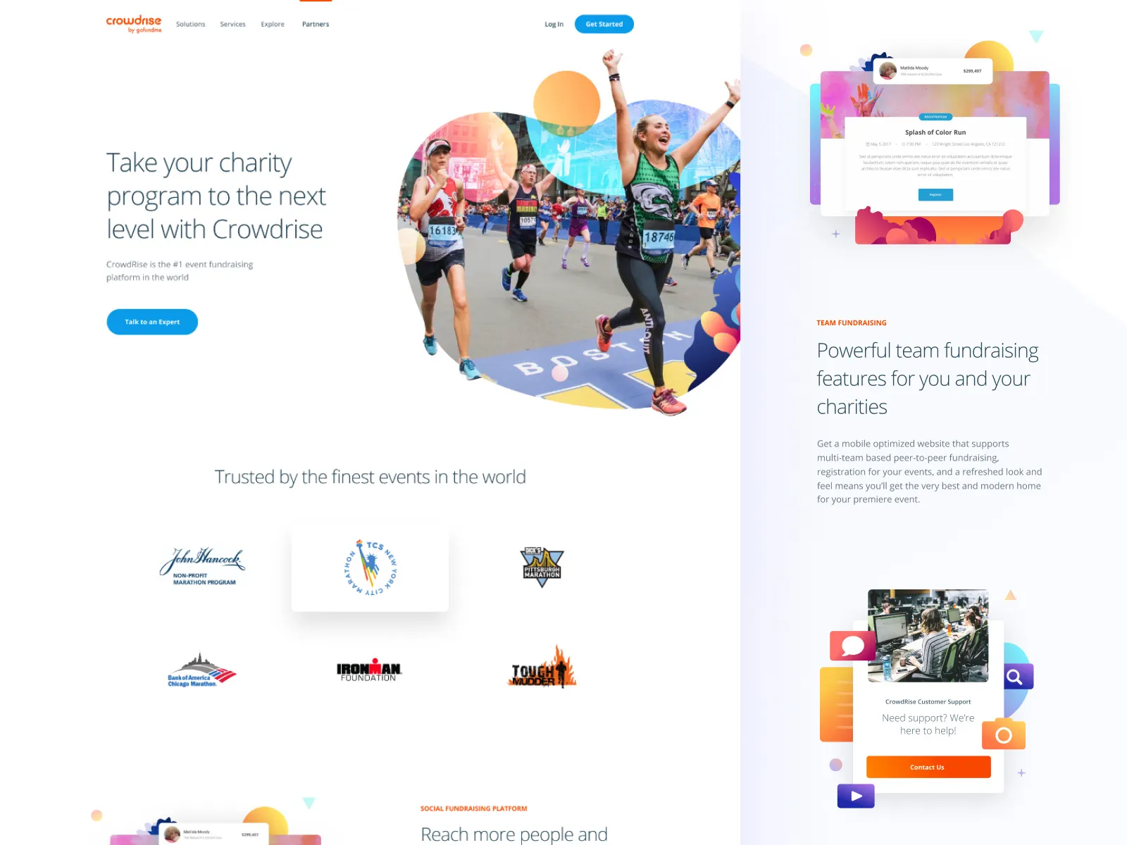
CrowdRise scaled fast, both technically and culturally. The platform became the go-to fundraising partner for large charity events and high-profile campaigns including the NYC Marathon, Boston Marathon, Ironman, and Tough Mudder.
Our UX and performance work supported more than 2M live campaigns, 1M donors, and a growing nonprofit network that spanned from local shelters to global organizations.
The balance of heart and humor stayed the same even as the stakes grew. Design became our competitive advantage because it made generosity feel personal at any scale.
Cross-Functional Collaboration
The product lived at the intersection of creative ambition and technical constraint. Dozens of voices shaped the vision -- founders like Edward Norton, Shauna Robertson, Robert and Jeffrey Wolfe, and investors from Bezos Expeditions to Union Square Ventures. Each had strong perspectives on how the platform should feel and perform. The work was to turn that energy into coherence.
I worked closely with the co-founder, CTO, and the Head of Product to build a process that kept design scrappy but thoughtful. The Detroit Customer Success team fed real human stories and product insights back into design. We were not A/B testing pixels. We were learning what made people care enough to give again.
The six-person product and engineering group in Los Angeles carried enormous expectations, and design became the connective tissue that kept everyone aligned. The Detroit team provided the heartbeat -- real stories, real frustrations, real feedback from thousands of nonprofits and fundraisers. Their insights grounded every sprint.
Weekly working sessions focused on clarity, not polish. The team learned to evaluate design by its ability to create momentum, not perfect pixels. Collaboration was constant between product, engineering, and success. Every release carried input from the field, from celebrity-driven campaigns to marathon charity partners like Boston, Chicago, Ironman, and Tough Mudder.
The challenge was to make alignment feel human, not bureaucratic. Design was the bridge, converting competing expectations into one shared language that scaled from small local causes to national events.
Behavior was anticipated and clarity was systematized across the product. Engagement shifted once the experience finally matched the intent.
“Brandon gave product and engineering a system we could build from. Decisions got faster, releases became more consistent, and the experience held together as the platform and team scaled.”
Justin McAuley
Head of Product, GoFundMe Charity (formerly CrowdRise)
“Brandon gave product and engineering a system we could build from. Decisions got faster, releases became more consistent, and the experience held together as the platform and team scaled.”
Justin McAuley
Head of Product, GoFundMe Charity (formerly CrowdRise)
“Brandon gave product and engineering a system we could build from. Decisions got faster, releases became more consistent, and the experience held together as the platform and team scaled.”
Justin McAuley
Head of Product, GoFundMe Charity (formerly CrowdRise)
Key Initiatives
Led UX and design from MVP through acquisition, scaling to 1M+ donors and 2M+ campaigns.
Rebuilt donation flows for clarity and humanity, improving completion speed by 35% and transactions by 18%.
Designed scalable UX templates that reduced nonprofit setup time by 50%.
Embedded WCAG 2.0 AA accessibility standards, reducing donor drop-off by 30%.
Directed brand and product alignment across web, mobile, and event experiences.
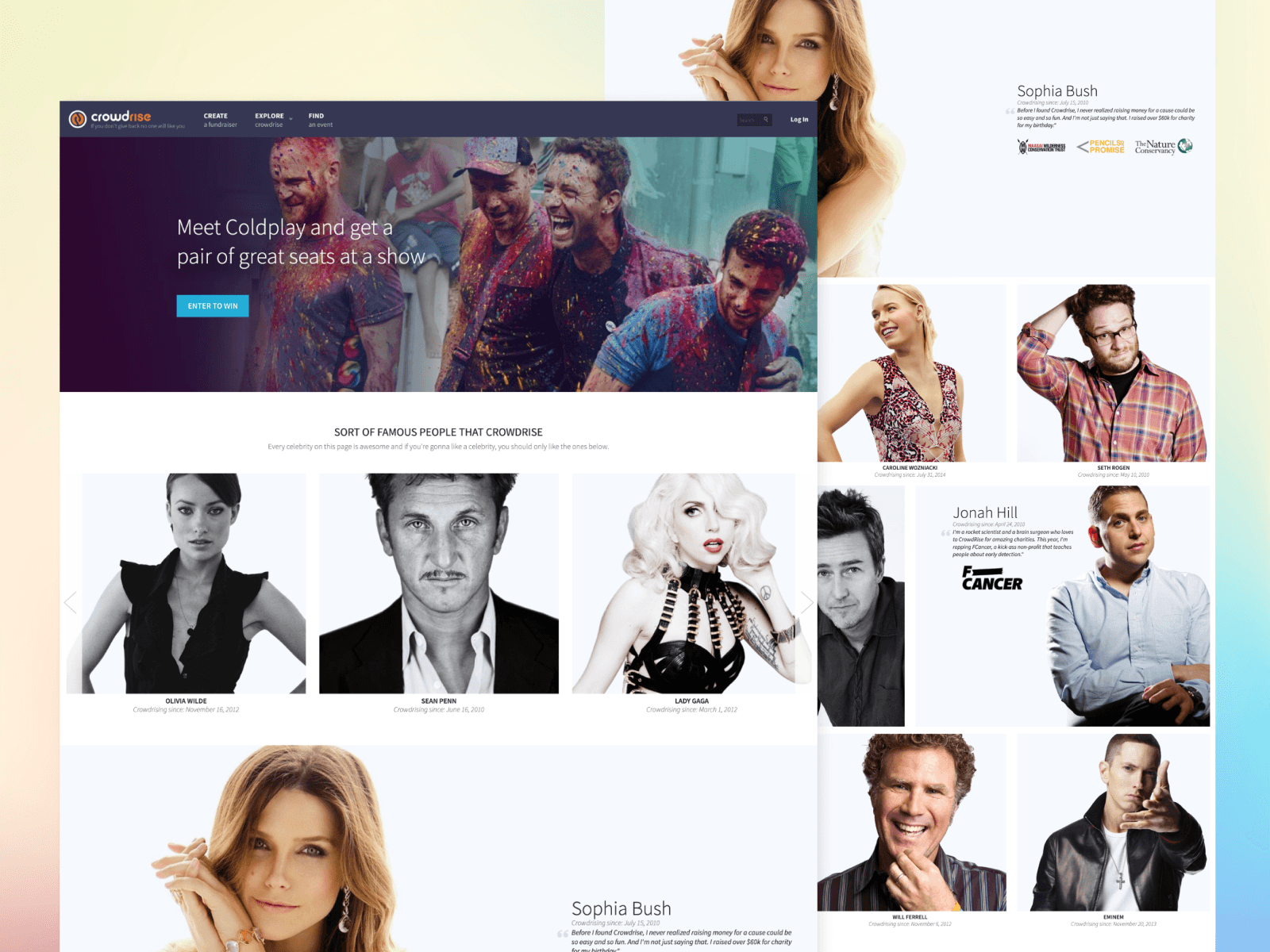
Collaborated with celebrity and charity campaigns that drove $15M+ in viral donations and national visibility.
Key Results
$500M+ total raised
20K+ nonprofits supported
2M+ campaigns launched
35% faster donation completion
30% reduction in drop-off
Positioned for acquisition by GoFundMe
Financial Impact & Business Enablement
CrowdRise did not sell fundraising. It sold hope that felt personal. The design system I built became the backbone of GoFundMe Charity, scaling laughter, kindness, and generosity across millions of campaigns.
Our approach, funny, fast, and human, worked.
35% faster donation completion
30% lower donor drop-off
12% higher average donation size
$15M+ driven through celebrity and event-led campaigns
CrowdRise’s mix of empathy and irreverence became its differentiator and the reason GoFundMe acquired it in 2017, valued at over $600M.
Role
Founding UX and Digital Strategy Lead, Los Angeles, CA and Remote (2012–2016). Reported to the co-founder and partnered closely with the CTO and PM.
First and only designer for most of the company’s growth, owning UX, brand, and systems end to end.
Architected the design system, unifying product and marketing while supporting 50+ engineers.
Rebuilt donation flows for speed, comprehension, and trust.
Embedded accessibility (WCAG 2.0 AA) and performance standards, reducing drop-off and improving returning donor rates.
Created scalable nonprofit templates that cut setup time in half and powered large events and celebrity campaigns.