Consolidating six module-specific Grids

A composable architecture standardized shared behavior and preserved product-specific workflows.

Work Delivered:

Cross-product Grid audit
Composable Grid architecture
Component model
Accessibility requirements
Design–code alignment
Governance framework

Consolidating six module-specific Grids

A composable architecture standardized shared behavior and preserved product-specific workflows.

Work Delivered:

Cross-product Grid audit

Composable Grid architecture

Component model

Accessibility requirements

Design–code alignment

Governance framework

Consolidating six module-specific Grids

A composable architecture standardized shared behavior and preserved product-specific workflows.

Work Delivered:

Cross-product Grid audit
Composable Grid architecture
Component model
Accessibility requirements
Design–code alignment
Governance framework
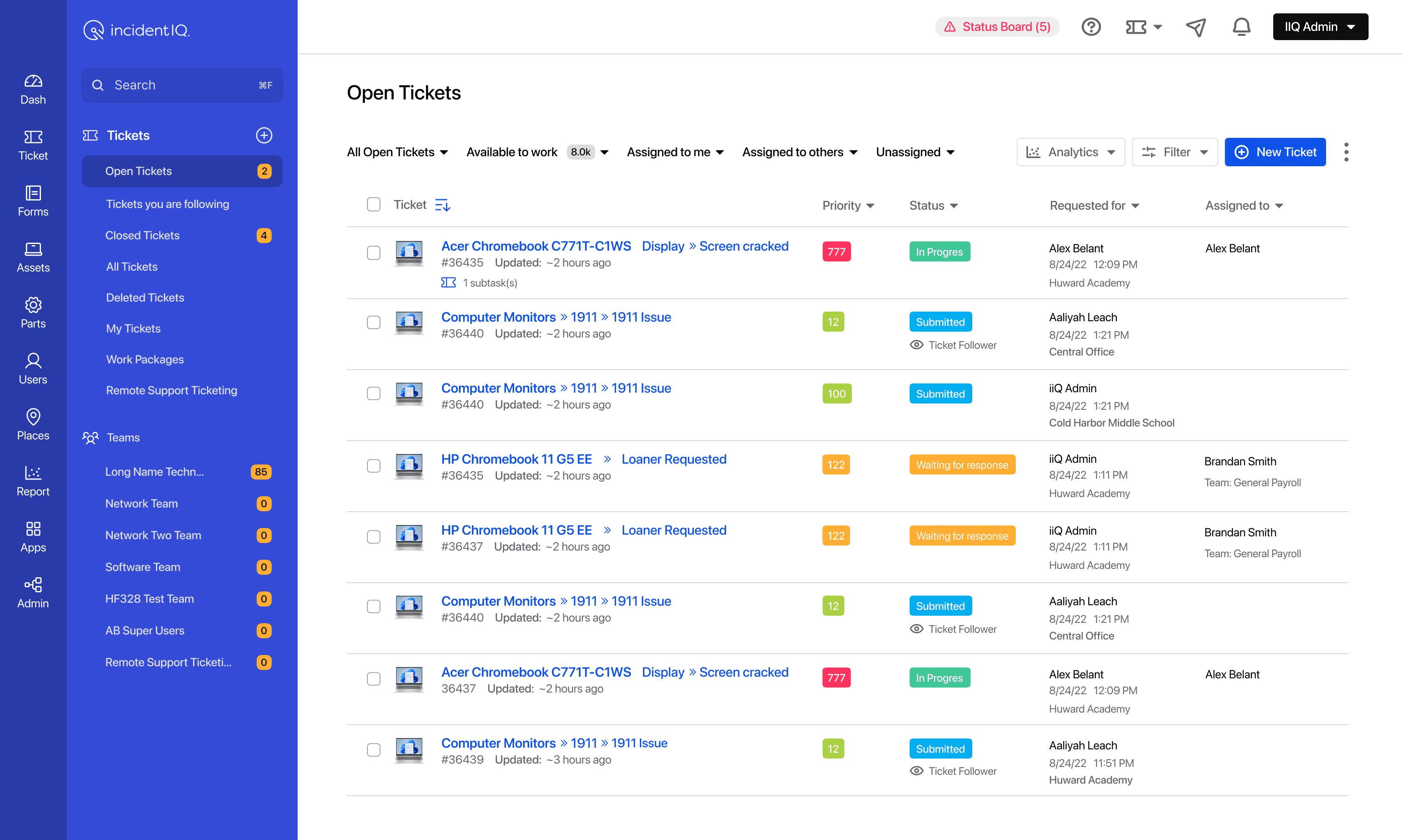
IncidentIQ Open Tickets Grid showing priority, status, requester, assignee, filtering, and pagination.

Role

Role

UX Director, Systems Designer

UX Director, Systems Designer

Partners

Partners

Product and Engineering

Product and Engineering

Product contexts

Product contexts

Tickets, Assets, Parts, and Rooms

2012

Industry

Industry

EdTech, K–12 SaaS

101-250

Scope

Scope

Audit, Architecture, Components, Governance

Audit, Architecture, Components, Governance

Platform scale

6 Grids, 7 modules

6 Grids, 7 modules

Project outcome

Project outcome

Grid implementations reduced 83%

Grid implementations reduced 83%

Highlights

  • Six Grid implementations consolidated into one, reducing implementation count by 83%

  • Validated across Tickets, Assets, Parts, and Rooms

  • Shared behavior separated from product-specific logic

  • Legacy implementations retired from design and code

  • One trackable system for ongoing iteration

Open Tickets Grid with row selection, bulk actions, filters, and pagination.

The problem

Incident IQ supported data-heavy operational workflows across Tickets, Assets, Parts, Rooms, and other product modules. Grids were the primary working surface in each context, and separate teams had implemented them around their immediate needs.

The overlap was clear: columns, rows, search, filtering, sorting, selection, and pagination. So was the variation: data schema, content density, permissions, actions, status, and workflow conditions.

By the time I began the project, six implementations were carrying similar behavior in different ways. The same foundational interaction model had to be designed, implemented, tested, and maintained multiple times.

The question was not whether to create a shared component. It was what the shared system should own and what each product needed to control.

My role

I led the work as Director of UX while remaining the hands-on systems designer. I audited the existing implementations, defined the architecture and component boundaries, designed the shared states and configuration model, and worked with Product and Engineering to align the Figma system with the implementation.

I also defined the accessibility requirements and the decision framework used to evaluate new requests.

Finding the shared system

Two implementations made the problem easy to see. Location Types and Event Types used the same underlying grid structure, but their schemas, content, role visibility, and workflow behavior were different.

Location Types Grid with search, name, and source columns.
Event Types Grid with search, source, and role-visibility columns.

The same structure supported different schemas, role visibility, and row content.

I expanded that comparison across the existing grids, grouped the recurring and variable requirements, and organized the findings into three layers:

  • A shared foundation for structure and interaction

  • A configurable layer for product data and workflow behavior

  • System requirements spanning accessibility, engineering, governance, and adoption

The audit also became the alignment tool. Instead of debating whether every Grid was unique, I could show Product and Engineering which behaviors repeated and which requirements came from product logic.

The audit led to a shared Grid foundation for layout, row behavior, selection, sorting, and pagination, with product-level configuration for columns, cell content, filters, actions, and empty states.

Grid audit separating configurable product logic, shared behavior, and system requirements.

Choosing composition over a monolith

I evaluated three directions:

  1. Continue building specialized grids. This gave each product immediate control but preserved duplicate implementation and inconsistent behavior.

  2. Put every requirement into one configurable component. This centralized the system but would create an expanding set of props, exceptions, and test cases.

  3. Build a composable architecture. Shared behavior could live in the foundation while product-specific content and workflow logic remained replaceable.

I led the team toward the composable model.

I defined the parent Grid to own cross-product behavior. Rows handled interaction and navigation. Cells carried content and workflow-specific meaning. That separation allowed the system to support legitimate differences without rebuilding the Grid for every product.

Defining the component boundaries

The architecture separated responsibility by layer:

  • Grid: layout, sorting, filtering, pagination, selection, bulk actions, and shared behavior

  • Row: hover and selected states, row actions, permissions, expansion, and navigation

  • Cells: reusable detail, status, header, filter, and action patterns

This gave Product, Design, and Engineering the same model for deciding where a requirement belonged.

Ticket Grid anatomy annotated with filters, column headers, rows, bulk actions, and pagination.

Testing the architecture across products

I tested the same architecture against Ticket, Asset, Part, and Room workflows. Each context used the shared Grid behavior while defining its own schema, columns, cell content, and available actions.

The type property selected the product context. Shared properties such as filters and selected controlled system behavior. An empty result remained a state of the Grid rather than another product context.

Prop

Type

Default

Figma status

type

“tickets” | “parts” | “assets” | “rooms”

tickets

available

filters

“true” | “false”

true

available

selected

“true” | “false”

false

available
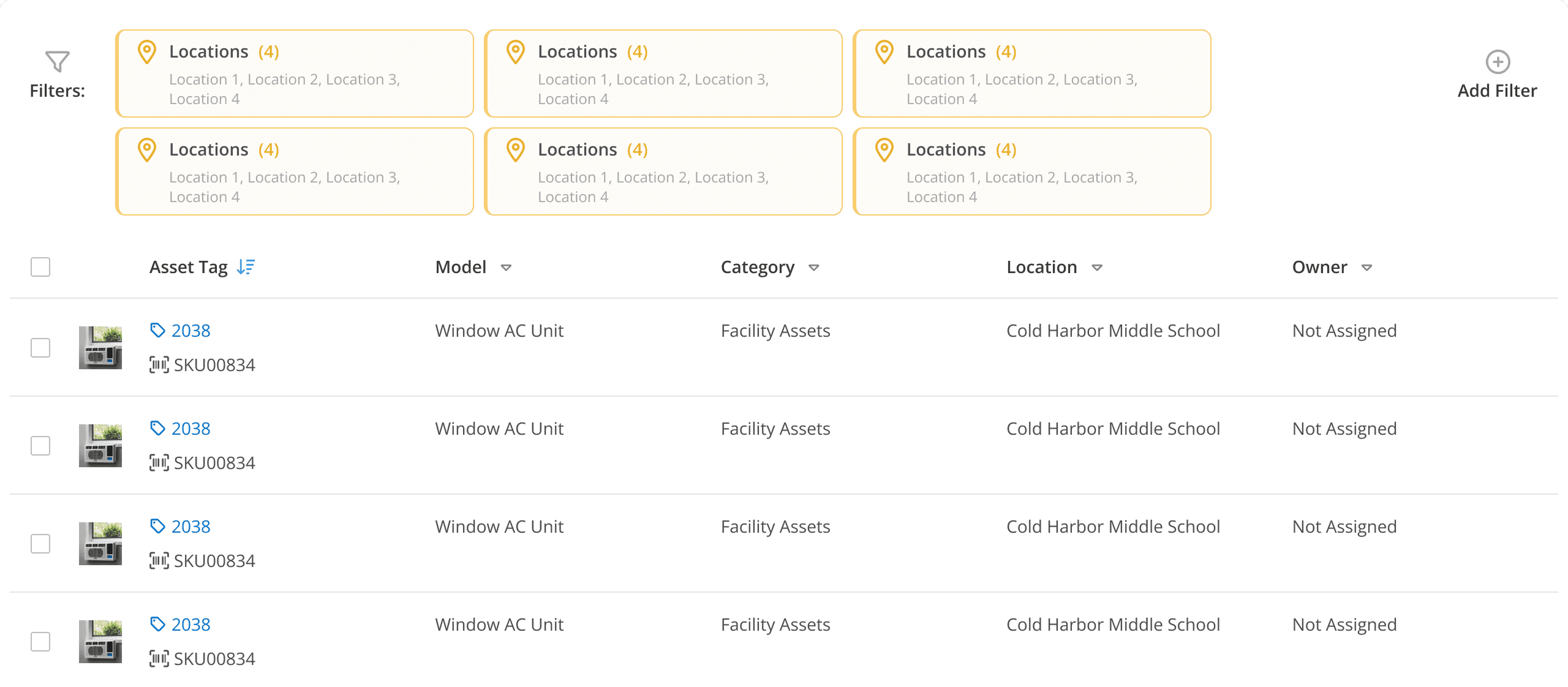
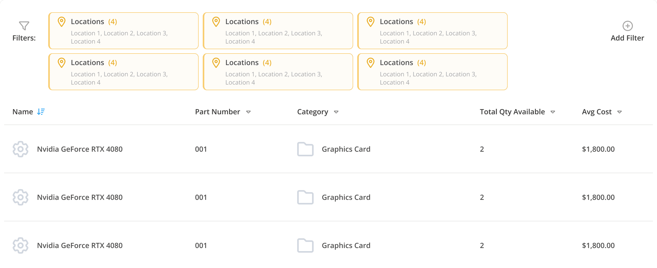
Shared Grid configured for asset records with model, category, location, and owner columns.
Shared Grid configured for ticket workflows with priority, status, requester, and assignee.
Shared Grid configured for parts inventory with part number, category, availability, and cost.
Shared Grid configured for rooms with room type, description, and event availability.

One shared foundation supporting four different product contexts.

Keeping configuration explicit

The technical challenge was only half of the problem. A component capable of supporting every module could still fail if designers could not understand how to configure it or if the Figma model drifted from the engineering model.

I kept the parent component’s configuration surface deliberately limited. Teams could select the product context and control shared behaviors without creating another Grid implementation. I worked with Engineering to keep the component boundaries and configuration logic aligned between Figma and code.

More specialized content stayed inside composed rows, cells, and actions instead of becoming business logic in the parent component.

Filters enabled

Ticket Grid with filter controls displayed above the column headers.

Filters disabled

Ticket Grid with filter controls removed while rows and shared controls remain.

Filters enabled

Empty state

Ticket Grid with filters enabled and no matching results.

“Brandon aligned Design and Engineering around one flexible Grid model that preserved product-specific needs.”

Principal Architect

Incident IQ

“Brandon really helped bring order and clarity to a challenging situation. His talent for turning design into practical steps, including clear roadmaps, performance metrics, and daily systems, made it easier for our teams to grow and work smoothly together.”

Principal Architect

Incident IQ

“Brandon really helped bring order and clarity to a challenging situation. His talent for turning design into practical steps, including clear roadmaps, performance metrics, and daily systems, made it easier for our teams to grow and work smoothly together.”

Principal Architect

Incident IQ

Stress-testing dense ticket content

Tickets were the most demanding context because a single row could contain dense content and multiple workflow conditions.

I used the Ticket Details Matrix to compare combinations of primary information, supporting metadata, status, alerts, and workflow conditions against one row architecture. Three craft decisions were central:

  • Information hierarchy: The ticket title remained the scanning anchor. The ID, update time, and supporting metadata occupied a quieter secondary level, while overdue and other exceptional conditions received a stronger signal.

  • Selection: A selected row gained a clear state and revealed bulk actions without changing the underlying column structure.

  • Empty results: The row region changed to an empty state while the surrounding Grid context remained stable.

Condition

Default State

Hover / Selected

Nested Content

Default

Default

Apple iPad 2 > Connectivity > Can’t access wifi

Apple iPad 2 > Connectivity > Can’t access wifi

Keyboard Focus

Apple iPad 2 > Connectivity > Can’t access wifi

Apple iPad 2 > Connectivity > Can’t access wifi

Apple iPad 2 > Connectivity > Can’t access wifi

Apple iPad 2 > Connectivity > Can’t access wifi

Read Only

Read Only

Apple iPad 2 > Connectivity > Can’t access wifi
Read Only!
# 94924 ○ In Progress ◷ Updated: 2/15/2024 6:41 PM

Apple iPad 2 > Connectivity > Can’t access wifi
Read Only!
# 94924 ○ In Progress ◷ Updated: 2/15/2024 6:41 PM

Keyboard Focus

Apple iPad 2 > Connectivity > Can’t access wifi
Read Only!
# 94924 ○ In Progress ◷ Updated: 2/15/2024 6:41 PM
3 subtasks

Apple iPad 2 > Connectivity > Can’t access wifi
Read Only!
# 94924 ○ In Progress ◷ Updated: 2/15/2024 6:41 PM
3 subtasks

Apple iPad 2 > Connectivity > Can’t access wifi
Read Only!
# 94924 ○ In Progress ◷ Updated: 2/15/2024 6:41 PM
3 subtasks

Apple iPad 2 > Connectivity > Can’t access wifi
Read Only!
# 94924 ○ In Progress ◷ Updated: 2/15/2024 6:41 PM
3 subtasks

Overdue

Overdue

Apple iPad 2 > Connectivity > Can’t access wifi
# 94924 ○ In Progress ◷ Updated: 2/15/2024 6:41 PM
Ticket Past Due: Feb 01, 2024 (15 days ago)

Apple iPad 2 > Connectivity > Can’t access wifi
# 94924 ○ In Progress ◷ Updated: 2/15/2024 6:41 PM
Ticket Past Due: Feb 01, 2024 (15 days ago)

Keyboard Focus

Apple iPad 2 > Connectivity > Can’t access wifi
# 94924 ○ In Progress ◷ Updated: 2/15/2024 6:41 PM
Ticket Past Due: Feb 01, 2024 (15 days ago)

Apple iPad 2 > Connectivity > Can’t access wifi
# 94924 ○ In Progress ◷ Updated: 2/15/2024 6:41 PM
Ticket Past Due: Feb 01, 2024 (15 days ago)

Apple iPad 2 > Connectivity > Can’t access wifi
# 94924 ○ In Progress ◷ Updated: 2/15/2024 6:41 PM
Ticket Past Due: Feb 01, 2024 (15 days ago)
3 subtasks

Apple iPad 2 > Connectivity > Can’t access wifi
# 94924 ○ In Progress ◷ Updated: 2/15/2024 6:41 PM
Ticket Past Due: Feb 01, 2024 (15 days ago)
3 subtasks

Resolved

Resolved

Apple iPad 2 > Connectivity > Can’t access wifi
# 94924 ○ In Progress ◷ Updated: 2/15/2024 6:41 PM

Apple iPad 2 > Connectivity > Can’t access wifi
# 94924 ○ In Progress ◷ Updated: 2/15/2024 6:41 PM

Keyboard Focus

Apple iPad 2 > Connectivity > Can’t access wifi
Read Only!
# 94924 ○ In Progress ◷ Updated: 2/15/2024 6:41 PM

Apple iPad 2 > Connectivity > Can’t access wifi
Read Only!
# 94924 ○ In Progress ◷ Updated: 2/15/2024 6:41 PM

Apple iPad 2 > Connectivity > Can’t access wifi
# 94924 ○ In Progress ◷ Updated: 2/15/2024 6:41 PM
3 subtasks

Apple iPad 2 > Connectivity > Can’t access wifi
# 94924 ○ In Progress ◷ Updated: 2/15/2024 6:41 PM
3 subtasks

The resulting row model supported default, hover, and selected states consistently. Product-specific conditions, such as a resolved ticket, remained part of the Ticket implementation rather than becoming universal Grid behavior.

Building accessibility into the architecture

I defined accessibility as system behavior, not a final review step.

I specified keyboard navigation, focus management, sort announcements, selection announcements, screen-reader compatibility, and consistent interaction states. Engineering could then implement those behaviors in the shared foundation rather than rebuilding them from product to product.

Connecting component intent to implementation

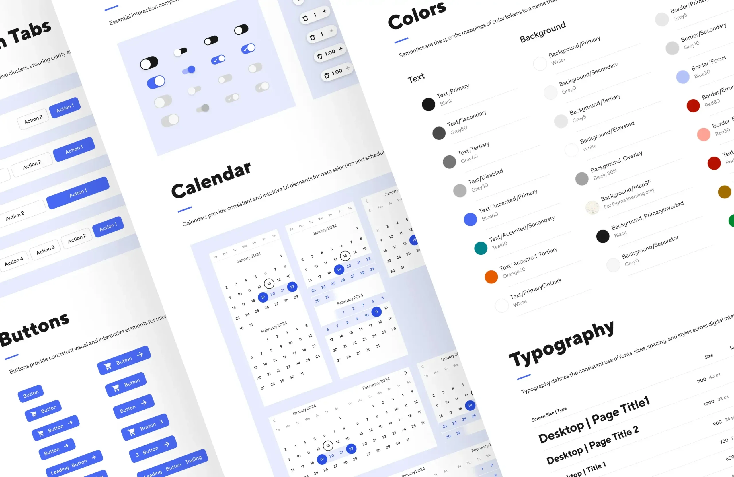
I connected Grid states to the broader design system’s semantic-variable layer. Primitive values mapped to semantic roles and component states so Design and Engineering could work from shared intent instead of selecting raw values independently.

The semantic layer made state behavior easier to inspect, document, implement, and maintain across Figma and production code.

Ticket row mapped to semantic tokens for focus, error, status, text, border, and background.

Semantic tokens connected interaction states, status, hierarchy, and structure to consistent visual behavior.

Establishing a decision model

A shared component would not prevent teams from introducing new variants. We also needed a decision process for new requirements.

Every request followed the same sequence:

  1. Reuse an existing pattern

  2. Extend an existing pattern

  3. Create something new only when the workflow introduced genuinely different behavior

The model gave Product and Engineering a shared way to distinguish a real product requirement from another duplicate solution.

Production use
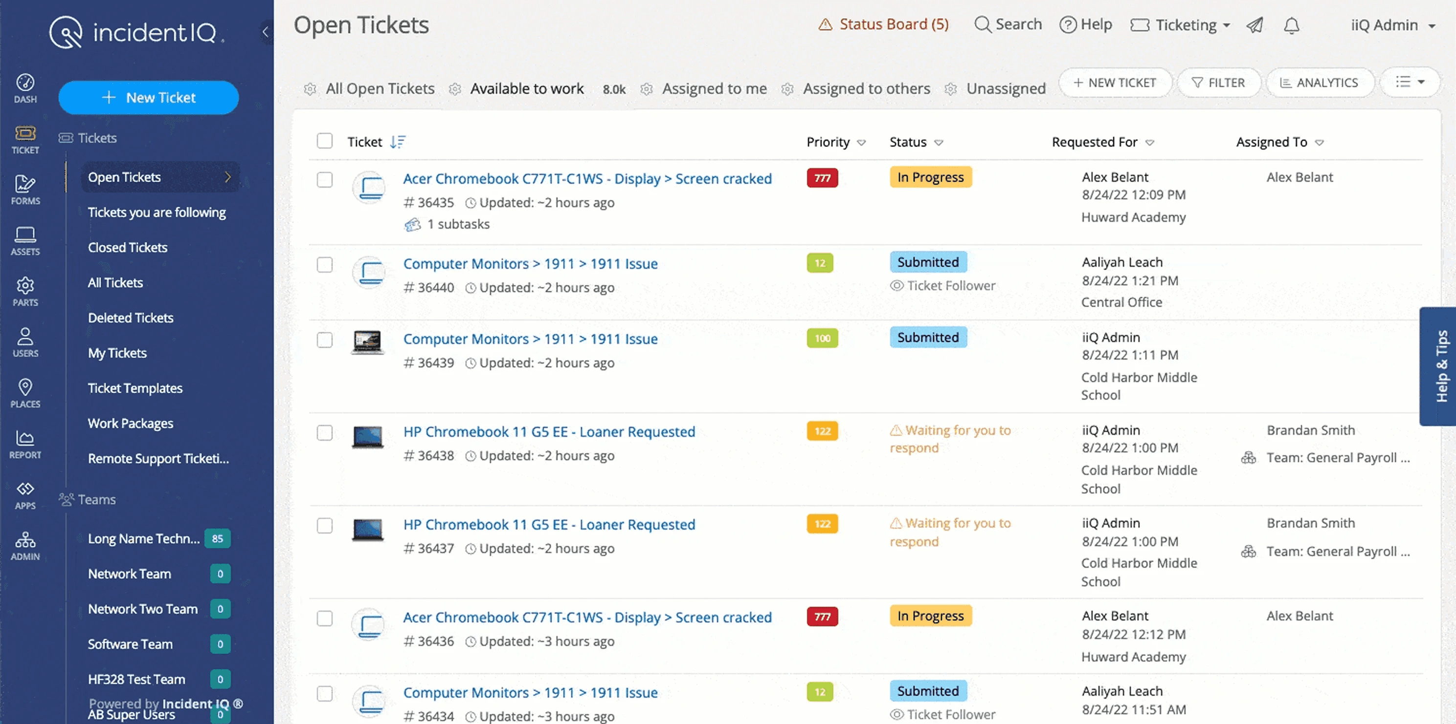
Shared Grid running in the production Open Tickets workflow with sorting, status, requester, assignee, and pagination.

Shared sorting, filtering, selection, bulk actions, row content, status, assignment, and pagination working within one production workflow.

The reusable architecture reduced duplicate solutions and established a more consistent foundation for data-heavy workflows. It also became a model for evaluating future component requests across the design system.

Outcomes

The project produced five direct outcomes:

  • Six independent implementations were consolidated into one shared Grid system, eliminating five separate implementations—an 83% reduction in implementation count.

  • The shared architecture was validated across four distinct product contexts: Tickets, Assets, Parts, and Rooms.

  • Legacy implementations were retired from design and code.

  • The component could be tracked as one system across the codebase, making adoption and divergence visible.

  • When a team detached or extended part of the system, that evidence became an input for improving the shared component instead of allowing another implementation to spread unnoticed.

The Grid also established explicit component, interaction, accessibility, and implementation boundaries, along with a shared decision model for reuse, extension, and new component creation.

Reflection

The implementations looked different at the surface, but the audit revealed that most of the variation lived in product content and workflow rules. The underlying structure and interaction model were largely shared.

The central design decision was therefore the boundary between shared infrastructure and product logic. That became a repeatable way to evaluate future cross-product components: identify the stable behavior first, isolate the variable product logic, and design the interface between them.

Related Case Studies

Scaled UX from MVP to enterprise—cut onboarding friction 30% and supported $1.3B growth.

Scalable UX

Activation 25%

Operational Clarity

Compliance UX

FinTech (SaaS)

Scaled $500M+ fundraising platform from MVP to acquisition. Led UX, design ops, and trust-first donation flows that enabled scalable giving.

Nonprofit Tech

Behavioral UX

Platform Startegy

Conversion 18%

$500M Donations

FinTech (SaaS)

Scaled national EdTech access platform to 25M+ users—led UX for SSO, onboarding, and system growth.

UX Systems

Brand Strategy

Conversion Clarity

Infrastructure-Led

Engagement 20%

10K+ Districts​

EdTech

Proof Slices

From complexity to first value

Workflow Architecture

Usability Validation

Onboarding

Making scheduling feel predictable

Workflow Clarity

Research & Validation

Dependencies

Building a grid that could scale

Design Systems

System Architecture

Scale & Reuse

A design system built for delivery

Design Systems

UX Strategy

DesignOps

Accessibility

Scaling with limited design capacity

Design Systems

Workflow Architecture

Reducing churn through clarity

Onboarding Redesign

Workflow Simplification

Protecting the product’s core promise

Roadmap Prioritization

Product Strategy

Making automation feel predictable

Product Judgment

Roadmap Influence

Designing confidence into automation

UX Tradeoff Decisions

Visual Feedback Design

Finding signal without analytics

Workflow Analysis

Customer Insight Synthesis

Making UX performance measurable

Metrics Architecture

DesignOps

System Design

a computer screen with a bar chart on it

Turning UX into a business signal

Product Alignment

Metrics Strategy

Executive Communication

black flat screen computer monitor

Research that shaped product decisions

Persona System Design

Research Synthesis

UX Strategy

Reducing friction for millions of students

K–12 Access

ID Management

Identity & Auth

black flat screen computer monitor

Web Identity

UX Systems

Design System Thinking

AI Workflow Architecture

Prompt Engineering

Information Architecture

A better system makes everyone’s day less stupid. Clarity pays for itself.

Related Case Studies

Scaled UX from MVP to enterprise—cut onboarding friction 30% and supported $1.3B growth.

Scalable UX

Activation 25%

Operational Clarity

$2.3B Valuation

FinTech (SaaS)

Scaled $500M+ fundraising platform from MVP to acquisition. Led UX, design ops, and trust-first donation flows that enabled scalable giving.

Nonprofit Tech

Behavioral UX

Platform Startegy

Conversion 18%

$500M Donations

Scaled national EdTech access platform to 25M+ users—led UX for SSO, onboarding, and system growth.

UX Systems

Brand Strategy

Conversion Clarity

Infrastructure-Led

Engagement 20%

10K+ Districts​

EdTech

A better system makes everyone’s day less stupid. Clarity pays for itself.

Related Case Studies

Scaled UX from MVP to enterprise—cut onboarding friction 30% and supported $1.3B growth.

Scalable UX

Activation 25%

Operational Clarity

$2.3B Valuation

FinTech (SaaS)

Scaled $500M+ fundraising platform from MVP to acquisition. Led UX, design ops, and trust-first donation flows that enabled scalable giving.

Nonprofit Tech

FinTech (SaaS)

Behavioral UX

Platform Startegy

Conversion 18%

$500M Donations

$500M Donations

Scaled national EdTech access platform to 25M+ users—led UX for SSO, onboarding, and system growth.

EdTech

UX Systems

Conversion Clarity

Brand Strategy

Infrastructure-Led

Engagement 20%

10K+ Districts​

FinTech (SaaS)

A better system makes everyone’s day less stupid. Clarity pays for itself.