Industry
Headquarters
Baltimore, MD
Role
Head of Product Design and Design Systems
Timeframe
2016–2023
Product
Scale
1M+ users across 25,000+ teams
Website
Overview
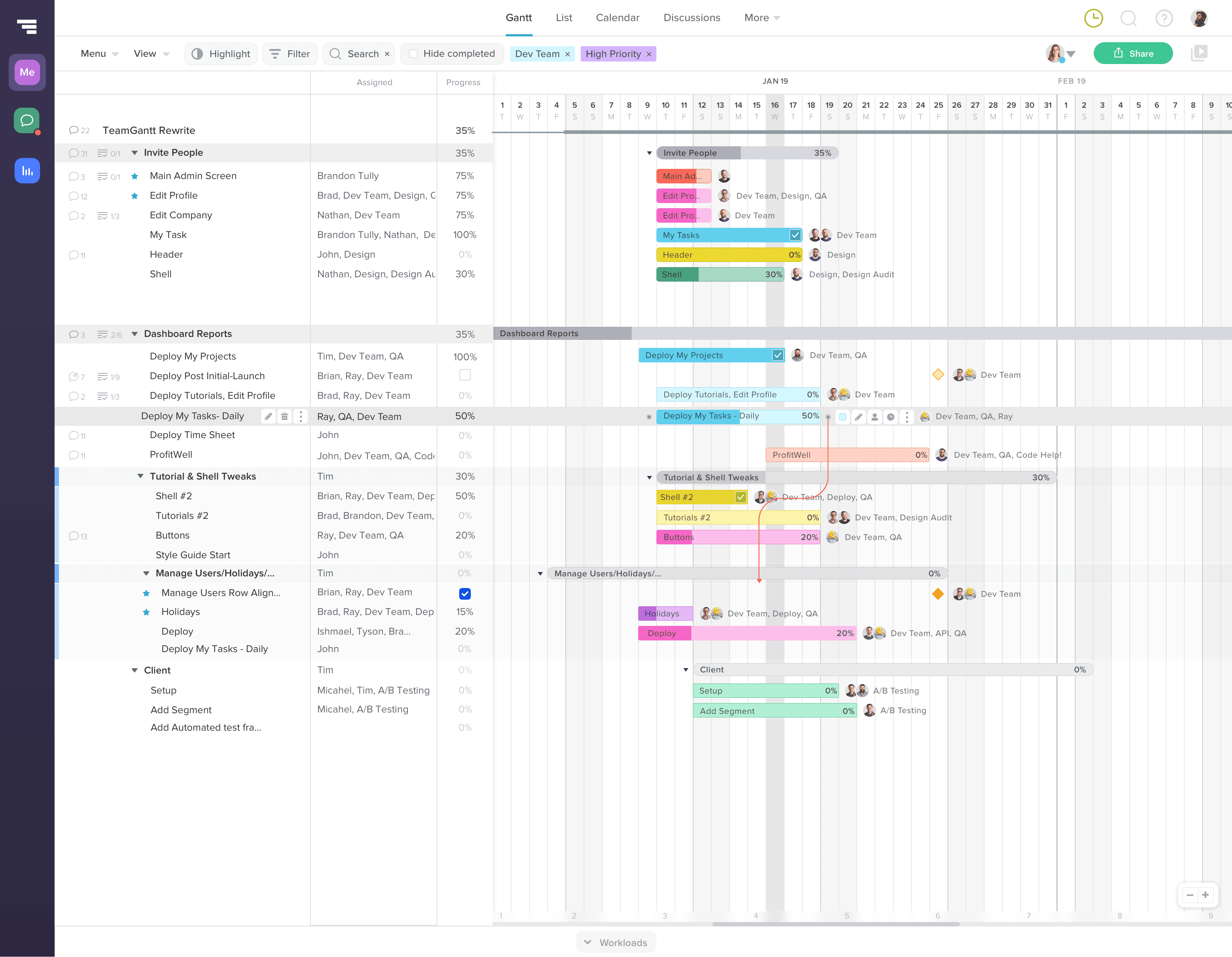
TeamGantt was created for teams that needed more structure than a spreadsheet but did not want the weight of enterprise project management software.
The product started with a clear advantage. It made Gantt planning more approachable. As the company grew, that simplicity became harder to protect.
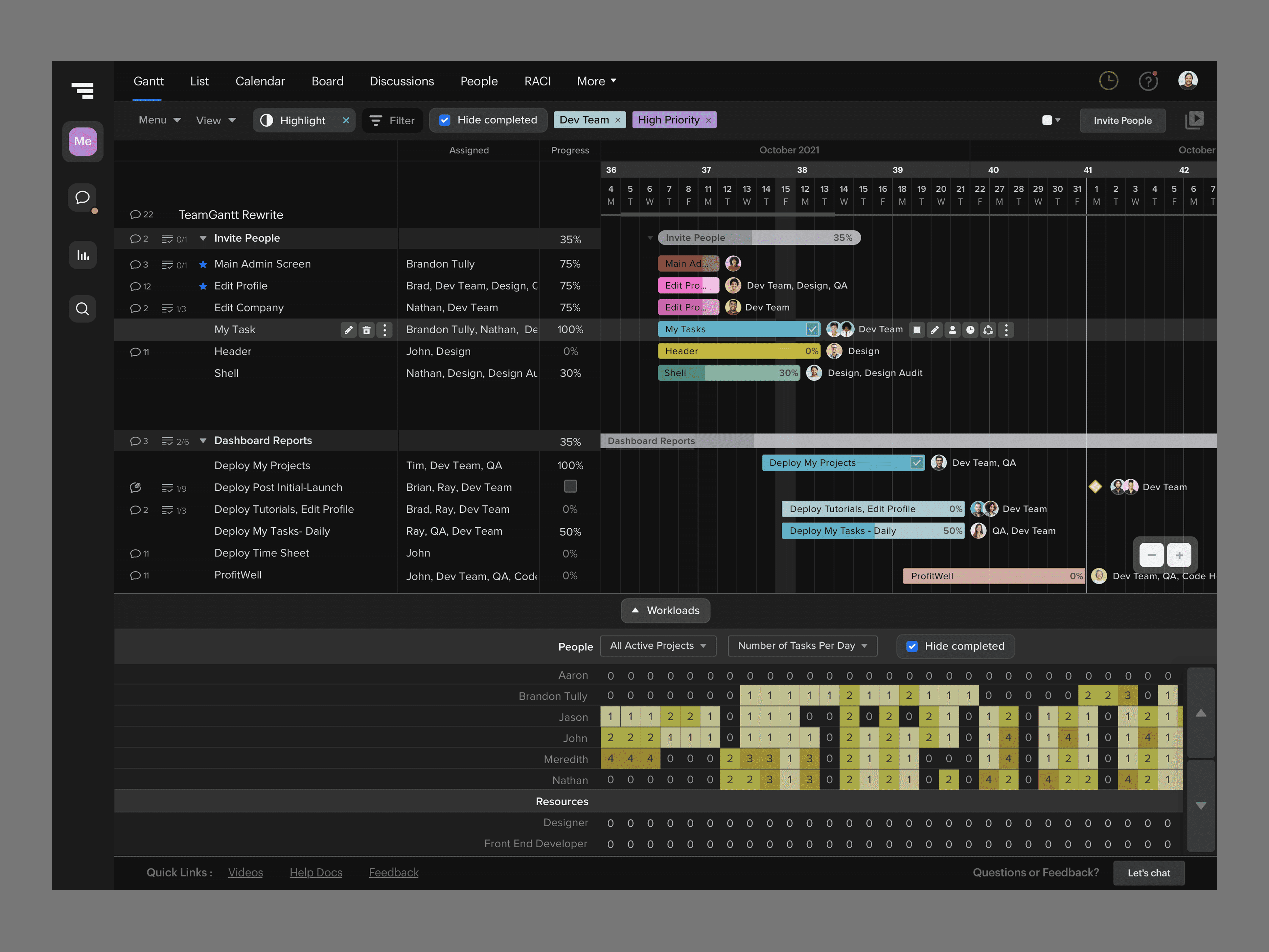
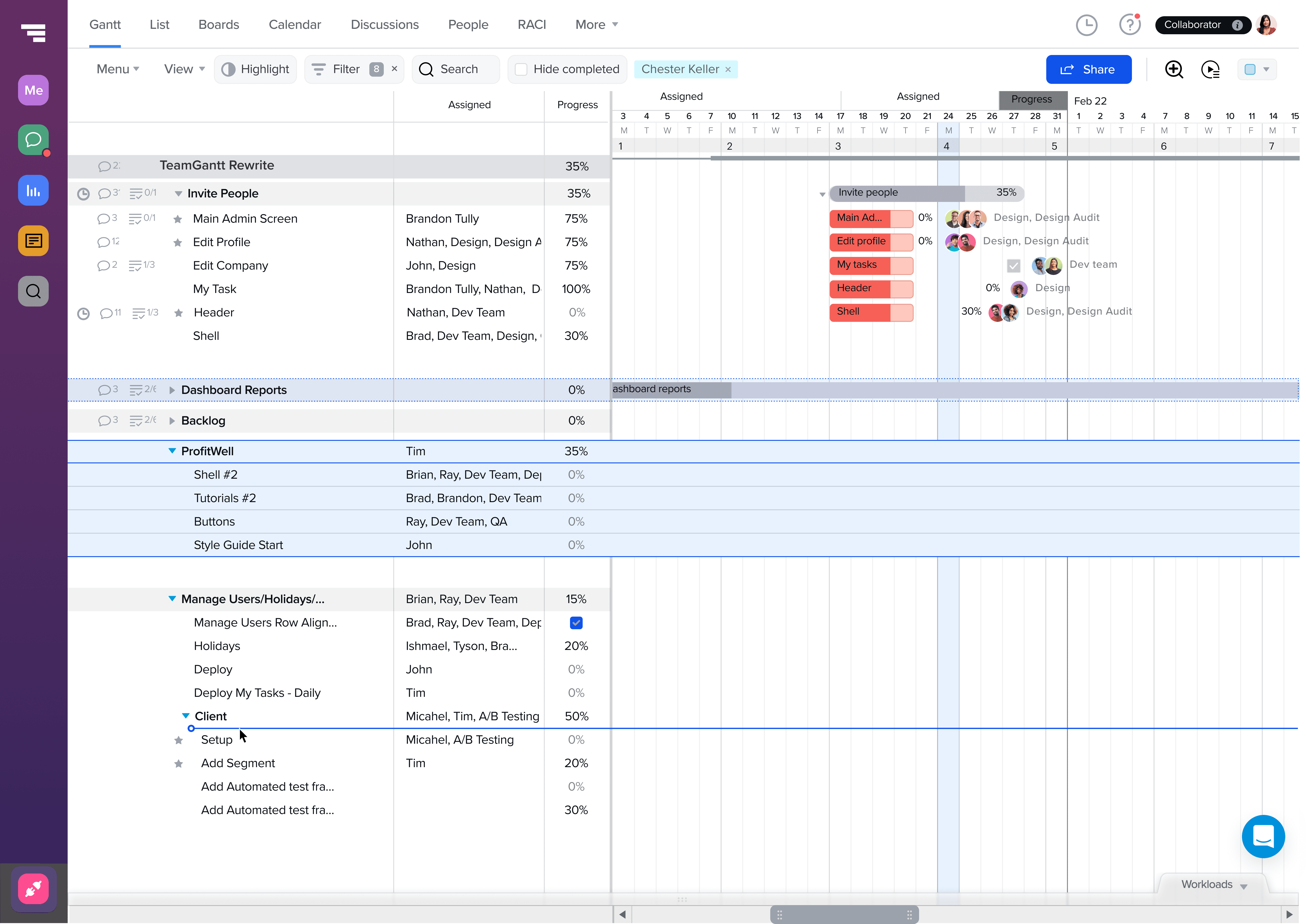
New customers brought different planning methods, team structures, and levels of project management experience. The platform expanded beyond Gantt charts into boards, workload, dependencies, collaboration, pricing, mobile, templates, education, and a larger public product experience.
Each new capability increased the value of the product. It also increased the chance that TeamGantt would become harder to understand.
I joined as the founding Head of UX and Design Systems and served as the principal product designer across web, iOS, and Android. My role covered the full experience, from product direction and core workflows to design systems, onboarding, pricing, brand, marketing, and engineering delivery.
The work centered on one problem.
How do you expand a project management platform without losing the clarity that made people choose it?
---
The challenge
The product had outgrown the structure of its early MVP.
Navigation, task planning, dependencies, workload, project setup, and account management had evolved at different times. Similar actions behaved differently across the interface. New features added capability but also increased cognitive load.
The problem was not a lack of functionality.
The problem was that customers had to understand too much of the product before they could complete basic work.
Early customer feedback and usage behavior pointed to recurring friction.
New teams struggled to create a useful project quickly.
Core planning actions were distributed across multiple interface areas.
Dependencies were powerful but difficult to predict.
Automation could save time while also reducing a user’s sense of control.
Advanced features risked overwhelming customers who needed a simpler planning model.
Product and marketing experiences were beginning to drift apart.
Engineering was rebuilding patterns that should have been shared.
At the time, churn reached as high as 12%.
The product needed a more durable structure before additional growth could compound the existing problems.
---
Product foundation
I treated TeamGantt as a connected planning system rather than a collection of features.
The core workflow was straightforward.
Create a project.
Define the work.
Organize tasks over time.
Connect dependencies.
Assign people and workload.
Track progress and collaborate.
Adjust the plan as conditions changed.
The product had to support that sequence while allowing different teams to enter and move through it in different ways.
A marketing team might begin with a template. A construction team might begin with dates and dependencies. A small agency might live in the board view. A project manager might move constantly between Gantt, workload, and reporting.
The interface needed one shared model beneath those variations.
I established consistent patterns for navigation, project structure, task behavior, dates, dependencies, assignment, status, feedback, and account-level controls. That gave new features a stable foundation and reduced the amount of product logic customers had to relearn.
The work also changed how product decisions were evaluated.
A feature was not successful because it added another control. It needed to make the core planning workflow easier to understand, faster to complete, or more useful over time.
---
Onboarding and activation
Onboarding was one of the clearest examples of the larger product problem.
New users arrived with a goal, but the product initially asked them to make too many structural decisions before they had experienced any value.
They needed to understand projects, tasks, groups, dates, dependencies, assignments, and views before they could see a useful plan.
I redesigned onboarding around the first successful planning outcome.
The experience focused on helping a new team reach a usable timeline quickly. Setup decisions were introduced in sequence. Templates reduced blank-state effort. Guidance appeared inside the workflow rather than in a separate instructional layer. The product showed enough structure to help without forcing every customer into the same project model.
The onboarding system balanced two needs.
Give new customers a clear path forward.
Preserve enough flexibility for different planning methods.
This work improved time to value by 25% and supported the broader reduction in churn.
---
Protecting clarity in a flexible product
TeamGantt’s customers did not all plan the same way.
Some wanted automation. Others wanted direct control over every date and dependency. Some needed a fast visual plan. Others managed complex schedules with multiple teams and resource constraints.
The product could not solve that range by adding settings for every preference.
The stronger approach was to create predictable defaults, then introduce control where it changed the outcome.
This principle guided decisions across the platform.
Automation suggested or updated work without hiding the result.
Dependency behavior stayed visible and reversible.
Advanced controls appeared when relevant instead of dominating the primary workflow.
Different views represented the same project model rather than separate products.
Users could move between Gantt, Board, workload, and reporting without rebuilding their plan.
The goal was not maximum automation.
It was useful automation that preserved understanding.
That distinction mattered most in scheduling. A project management tool can save time by moving tasks automatically, but the user still needs to understand why the schedule changed and how to correct it.
---
Dependencies and scheduling
Dependencies were essential to TeamGantt’s value and one of the most difficult interaction problems in the product.
A dependency is simple in theory. One task must occur before another.
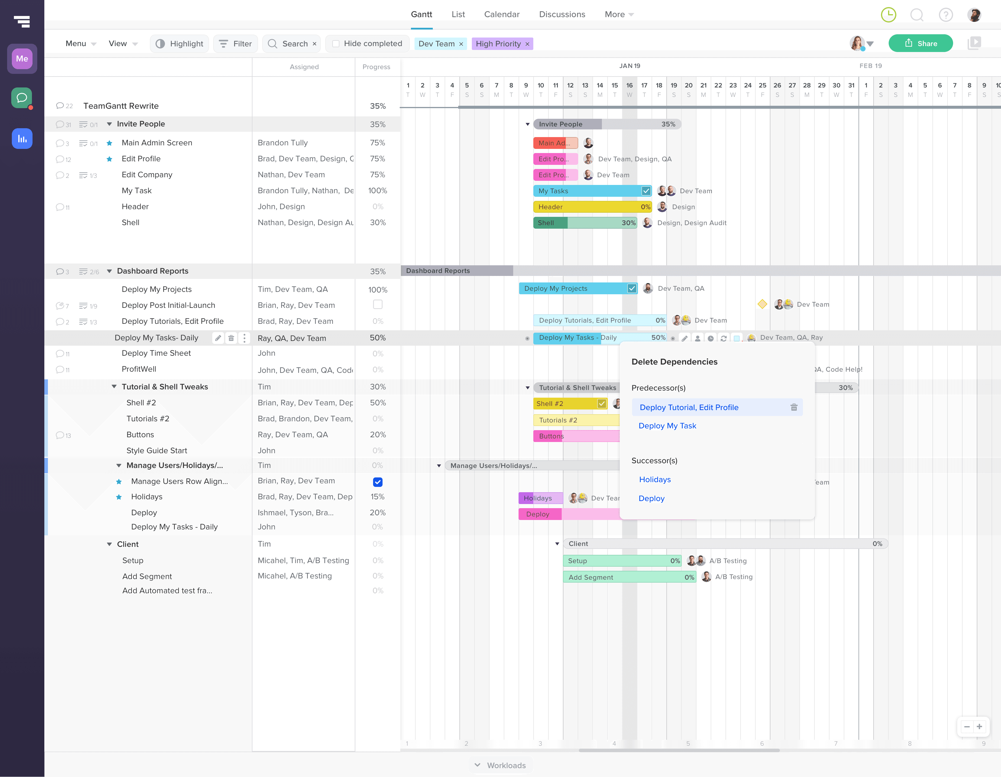
In practice, users needed to understand task order, date changes, lag, schedule movement, exceptions, and the effect of editing either side of the relationship.
Earlier versions exposed the connection without always making the resulting behavior clear.
I reframed dependencies around cause and effect.
The interface needed to answer three questions.
What is connected?
What changed?
What will happen if I move this task?
The work clarified creation, editing, visual feedback, schedule movement, and exception handling. Dependency behavior became easier to predict without weakening the power of the scheduling model.
The same principle applied to automation. The product could move work, but the user needed to retain a clear mental model of the plan.
This was less about simplifying the feature than making the underlying logic visible at the right moment.
---
Platform expansion
As TeamGantt grew, the product expanded beyond its original timeline experience.
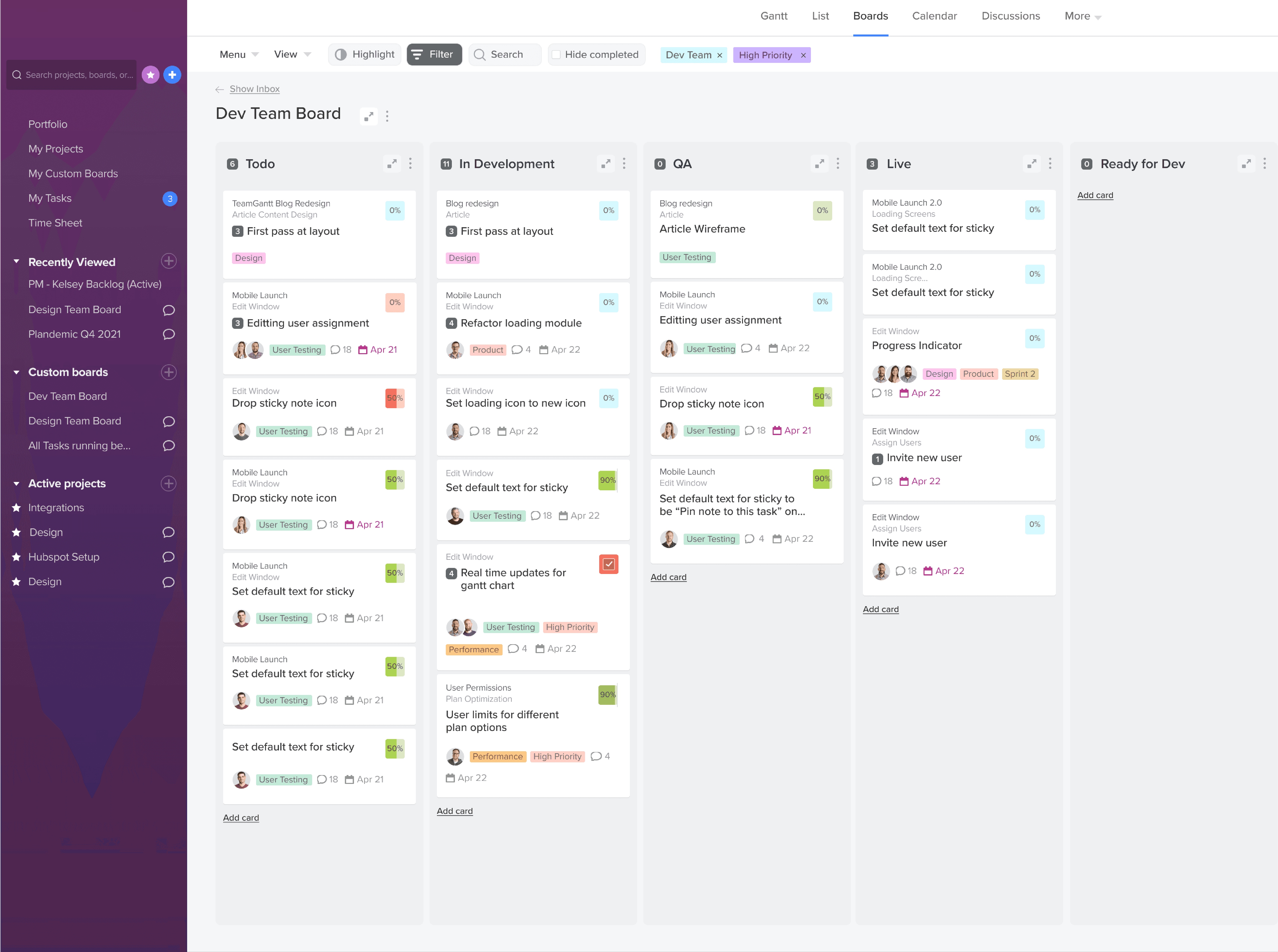
Board view supported teams that organized work by status. Workload and resource planning helped managers understand capacity across people and projects. Reporting, discussions, templates, and mobile experiences extended the platform into more of the team’s daily work.
The challenge was maintaining one product model across those surfaces.
Board view could not become a separate task system. Workload could not introduce another assignment model. Mobile could not reduce the product to a read-only companion. Each surface needed to reflect the same underlying project structure while adapting to a different use case.
I led product design across those experiences and used the design system to maintain continuity across web, iOS, Android, product marketing, and support content.
The platform became broader without requiring customers to learn a separate product for each capability.
---
Design system
The design system was created to support product delivery, not to document a finished interface.
TeamGantt had a small team and a large product surface. Design and engineering could not afford to solve the same interaction problem repeatedly.
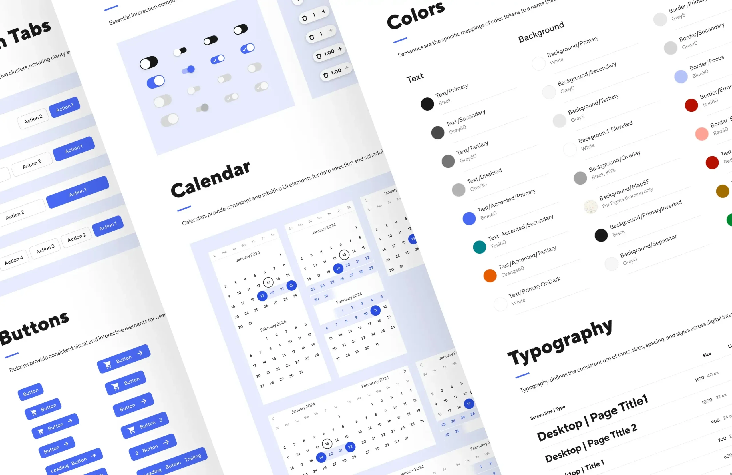
I established shared foundations across typography, color, spacing, layout, components, states, navigation, forms, data presentation, responsive behavior, and mobile patterns.
The system connected Figma, reusable CSS, Storybook, and production components. Product and marketing used the same visual foundations while retaining the patterns required by each environment.
The important measure was not component count.
It was whether the system reduced ambiguity and made the next feature easier to deliver.
Governance focused on practical decisions.
Reuse an existing pattern when the behavior matched.
Extend a pattern when the need was related.
Create a new pattern only when the product introduced a genuinely different behavior.
Document interaction and state logic, not only visual appearance.
Validate implementation before inconsistencies spread across the product.
This work improved engineering delivery consistency by 65% and reduced the amount of design and development effort lost to duplicated patterns and rework.
---
Growth platform
The public product experience evolved alongside the application.
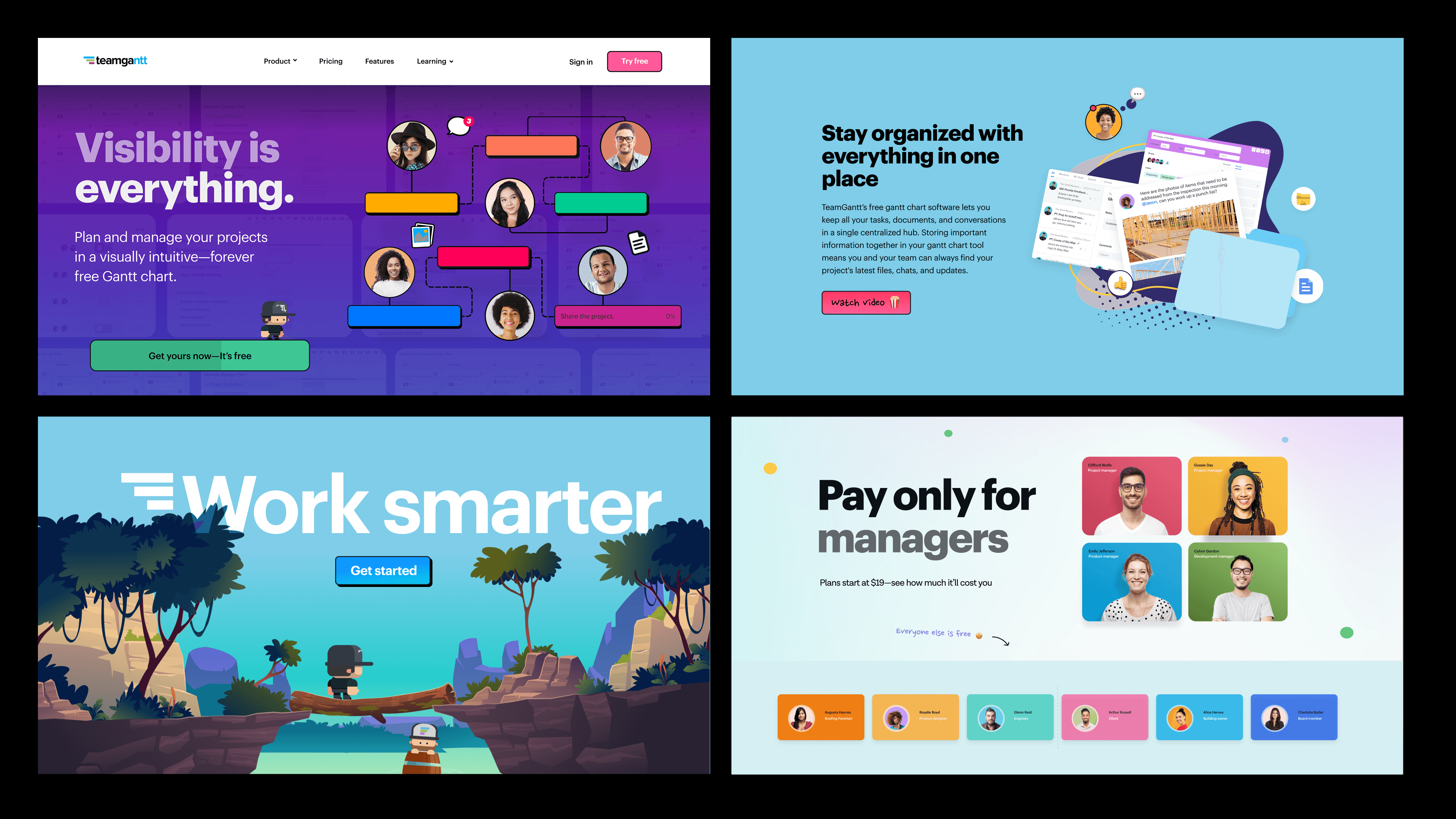
TeamGantt needed to explain a flexible planning platform to customers with different levels of project management experience. The website, pricing model, templates, guides, educational content, and product launches became part of the same experience system.
I led the redesign of the marketing platform and moved the site to Webflow to improve publishing speed, performance, and experimentation.
The public experience focused on helping visitors understand three things quickly.
What TeamGantt helps a team do
How it differs from heavier project management tools
Which product path fits the way that team works
Pricing and plan selection were redesigned around customer needs rather than a feature inventory. Product education expanded through guides, templates, video, and content programs that helped customers understand both the software and the planning practices behind it.
That broader system increased conversion by 20% and gave the company a faster way to support launches, test positioning, and explain new capabilities.
---
Product decisions with limited data
TeamGantt did not always have the research infrastructure or sample sizes available inside a larger product organization.
That did not remove the need for evidence. It changed how evidence was assembled.
I combined customer conversations, support themes, usage behavior, sales feedback, product analytics, usability sessions, and direct observation of where customers became confused.
The goal was not to wait for perfect certainty.
It was to make the best available decision, define what should change if the decision was wrong, and keep the product flexible enough to learn.
This approach was especially important when protecting the core workflow.
Requests often reflected a legitimate local need. The product still had to determine whether solving that need would improve the shared system or add another exception customers would need to understand.
The recurring question was simple.
Does this make planning clearer for more teams, or does it make the product more configurable for one case?
That judgment helped the platform expand while preserving a recognizable product model.
---
Business impact
The product and system work supported TeamGantt’s growth from an early SaaS company into a mature planning platform.
ARR grew from $1.8M to $8M.
UX-attributed growth reached $1.7M.
Conversion increased 20% through improvements to performance, pricing, and core flows.
Time to value improved 25% through onboarding and activation changes.
Churn decreased from 12% to 4% as workflow clarity and product adoption improved.
Engineering delivery consistency improved 65% through shared components, standards, and Storybook documentation.
The platform grew to more than 1 million users across 25,000+ teams.
The numbers reflect work across the full product system rather than one redesign.
Onboarding improved the first experience. Core workflow changes made planning easier to understand. The design system improved delivery. Pricing and marketing strengthened acquisition. Platform expansion increased the value of the product over time.
---
Role
Head of Product Design and Design Systems
2016–2023
Served as the founding design leader and principal individual contributor across web, iOS, and Android.
Owned product design, design systems, onboarding, pricing, growth, marketing systems, mobile experience, product launches, and design-to-engineering delivery.
Partnered directly with the founders and engineering leadership to shape product direction, simplify complex planning workflows, establish reusable systems, and connect design decisions to customer and business outcomes.
---
Reflection
TeamGantt taught me that product simplicity is not created by limiting capability.
It comes from giving a growing system a clear structure.
The product expanded from a focused Gantt tool into a broader planning platform. The work was deciding how each new capability should connect to the existing model so customers could gain more value without carrying more product complexity.
That required attention at every level.
The onboarding sequence. The behavior of one dependency. The relationship between Gantt and Board. The architecture of the design system. The pricing model. The public product story. The way design decisions reached production.
Over seven years, those decisions created a platform that could grow without losing the reason customers chose it in the first place.
---
Founder perspective
“Brandon’s willingness to collaborate, work with others, and try ideas to see what works, along with his natural design intuition and talent, leads to great outcomes.” — Nathan Gilmore, Co-founder, TeamGantt
“Brandon is fast, organized, and has taken TeamGantt design to a new level.” — John Correlli, Co-founder, TeamGantt
---
Supporting proof slices
Simplifying complex workflows through onboarding
Reducing churn through workflow clarity
Shaping product direction around the core workflow
Protecting clarity over automation
Resolving dependency confusion
Balancing automation and user control
Delivering under system constraints
Making product decisions with limited data